Radical Vibrancy: How Seoul’s Visual Identity for the 2027 World Design Congress Defies Corporate Norms

After two decades of chronicling the global design industry, I have attended my fair share of creative conferences. From the minimalist, stark auditoriums of European summits to the tech-heavy, neon-drenched expos of the West Coast, the visual identity of these gatherings serves as a litmus test for the industry’s current mood. Usually, these identities follow a predictable, safe trajectory: a singular, sans-serif typeface, a muted monochromatic palette, and a logo that feels intentionally designed to be inoffensive to corporate sponsors.
However, the recently unveiled visual identity for the World Design Congress (WDC) Seoul 2027 breaks this cycle with refreshing, almost rebellious, aplomb. In an era where "professionalism" in design has become synonymous with a bland, focus-grouped sameness, the work created by Seoul-based studio Everyday Practice is a startling, necessary wake-up call. It is loud, it is chaotic, and it is undeniably brilliant.
The Main Event: A Shift in Creative Direction
The World Design Organization (WDO), the international non-governmental body tasked with championing industrial design, has long maintained a reputation for institutional prestige. Founded in 1959, the organization’s flagship event, the World Design Congress, serves as the premier forum for global design leaders. With the 35th edition scheduled to take place in Seoul, South Korea, from September 22 to 25, 2027, the WDO was tasked with crafting a visual language that could encapsulate not just the essence of the city, but the future of the design discipline itself.
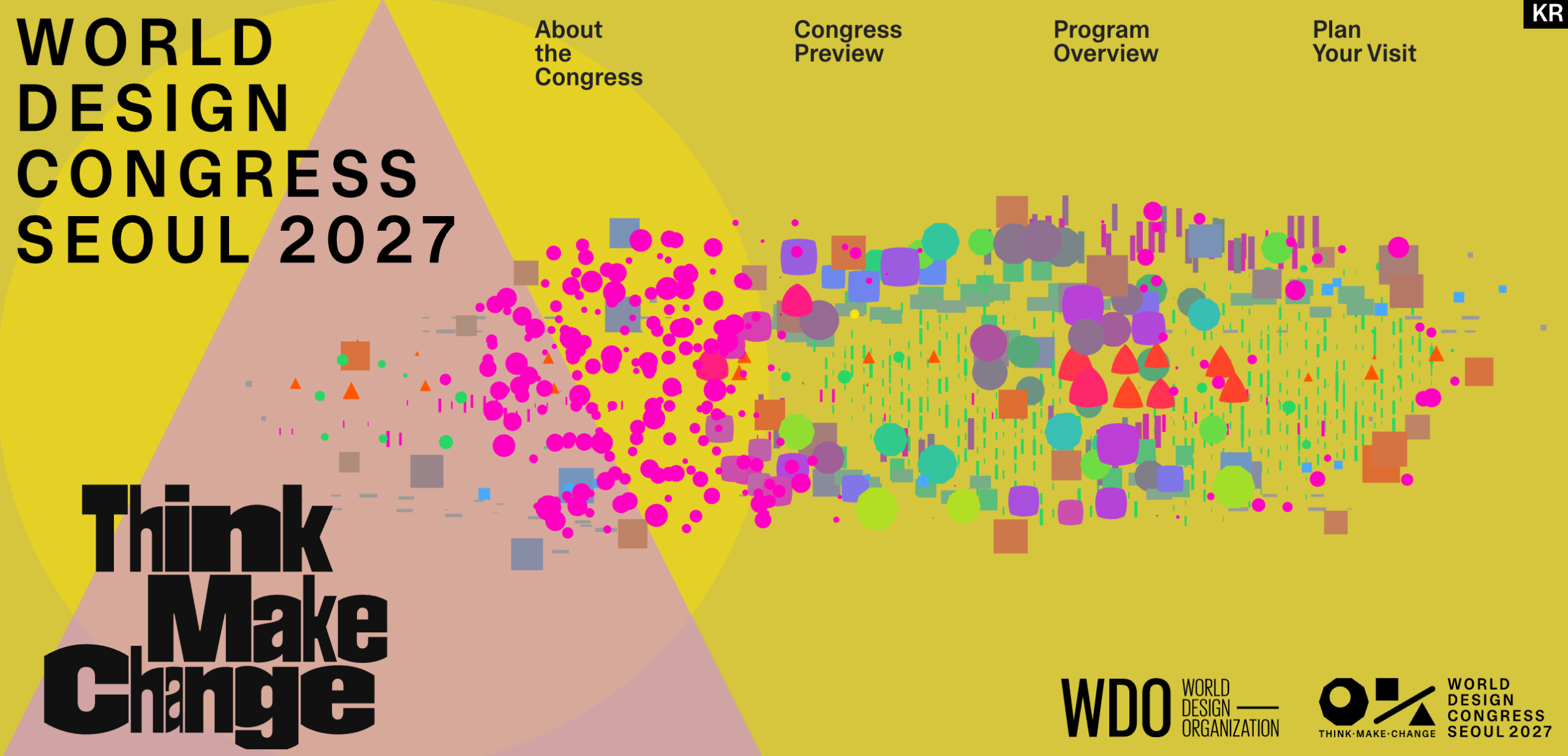
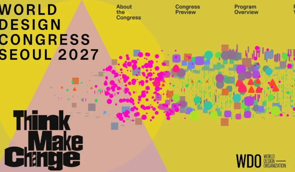
The resulting identity—now live on the World Design Congress 2027 website—is a departure from the expected. It features clashing, vibrant color palettes, a kinetic "seesaw" logo that seems to perpetually shift, and scattered geometric motifs that defy the rigid grid systems favored by most institutional branding. It is, by all traditional metrics of "corporate design," a risk. Yet, it is exactly the kind of risk that justifies the existence of a design congress in the first place.
A Brief Chronology: From London to Seoul
To understand the significance of the 2027 identity, one must look at the recent history of the WDC. The organization rotates its host city every two years, allowing the design language to evolve with each location.
- 1959: The WDO (formerly ICSID) is established, setting the foundation for global industrial design standards.
- 2023–2025: The organization focused on themes of urban resilience and sustainability, culminating in the 2025 edition held at the historic Barbican in London. The London branding was sophisticated, architectural, and highly structured, fitting the Brutalist backdrop of the venue.
- 2027: The torch passes to Seoul. South Korea has become a global epicenter for creative innovation, blending deep-rooted tradition with hyper-modern digital infrastructure.
- 2024: Development of the visual identity begins. The WDO selects the Seoul-based design firm Everyday Practice to spearhead the creative strategy.
- 2025 (Present): The identity is unveiled, signaling a massive pivot from the rigid, monochromatic trends of the early 2020s toward a more fluid, maximalist aesthetic.
Decoding the DNA: The Concept Behind the Chaos
What separates the Seoul 2027 identity from mere "gimmicky" design is the rigorous conceptual framework provided by Everyday Practice. The studio did not simply choose bright colors because they looked "fun"; they synthesized the very fabric of Seoul into a visual lexicon.
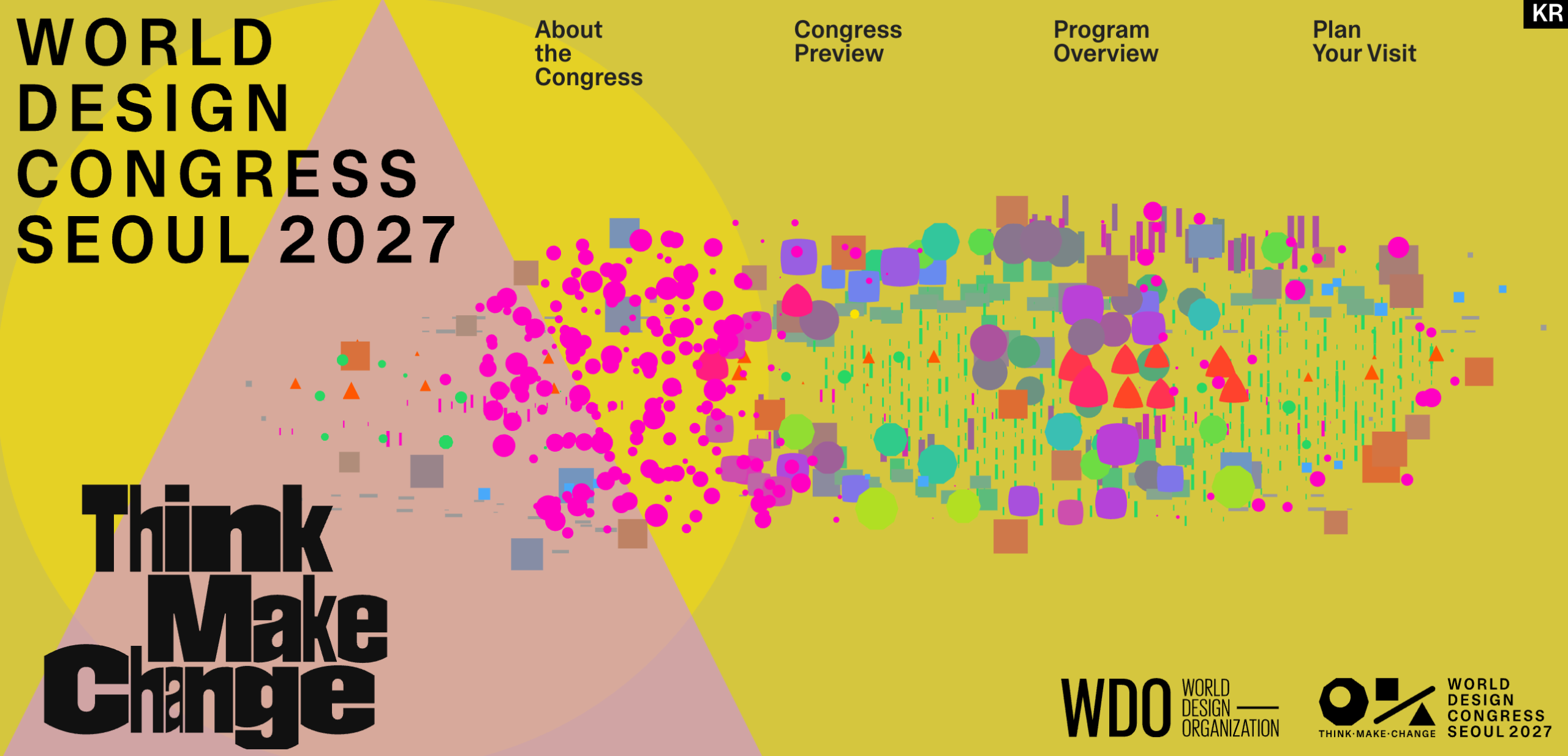
Seoul is a city defined by extreme contrasts. It is a metropolis where 600-year-old palaces exist in the shadow of 100-story glass skyscrapers, and where quiet, traditional teahouses sit just meters away from neon-lit, 24-hour nightlife. This tension is the backbone of the identity.
The Seven-Color Palette
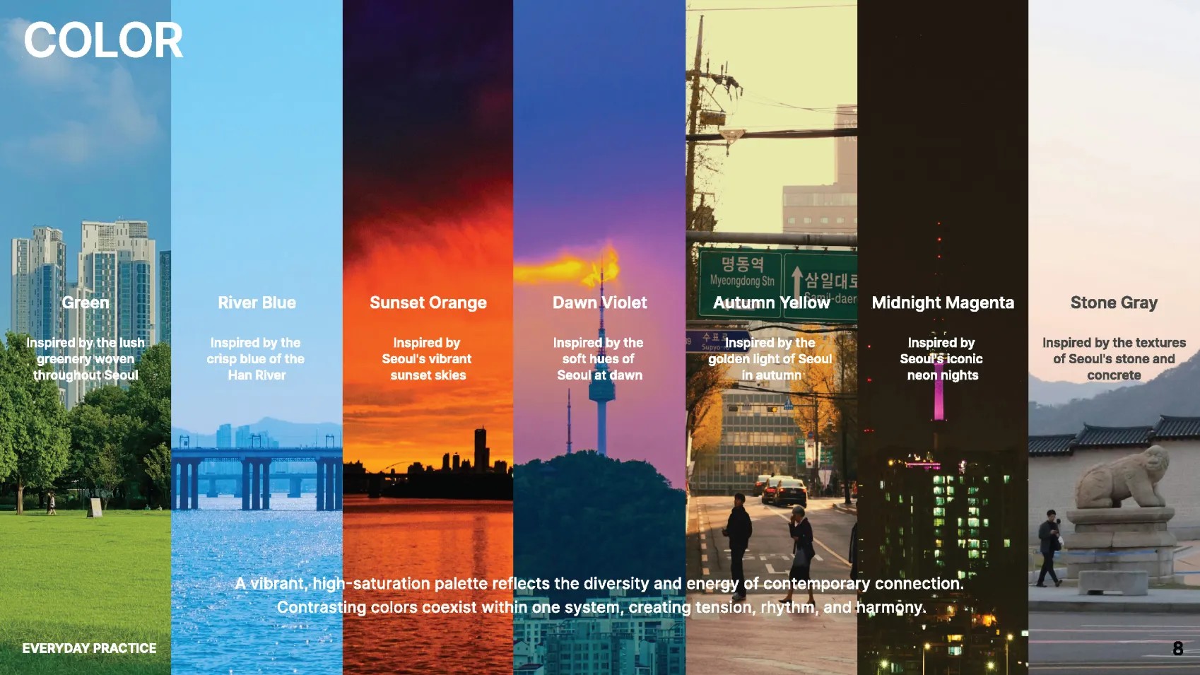
The color scheme is the most immediate point of departure from standard branding. It utilizes seven distinct hues, each a direct reference to the geography and culture of the South Korean capital:
- Green: Representing the city’s extensive urban parks and mountains.
- River Blue: A nod to the Han River, the central artery of the city.
- Sunset Orange: Capturing the atmospheric transition over the Seoul skyline.
- Midnight Magenta: Inspired by the city’s vibrant, nocturnal energy.
- Dawn Violet: Reflecting the soft, early-morning light of the urban landscape.
- Autumn Yellow: A tribute to the seasonal transformation of the city’s foliage.
- Stone Gray: The grounding color, representing the ancient architecture and traditional materials of the city’s historic core.
By allowing these colors to interact through a generative, scattering system, the design avoids looking muddy. Instead, it creates a sense of harmony that feels modern and alive.
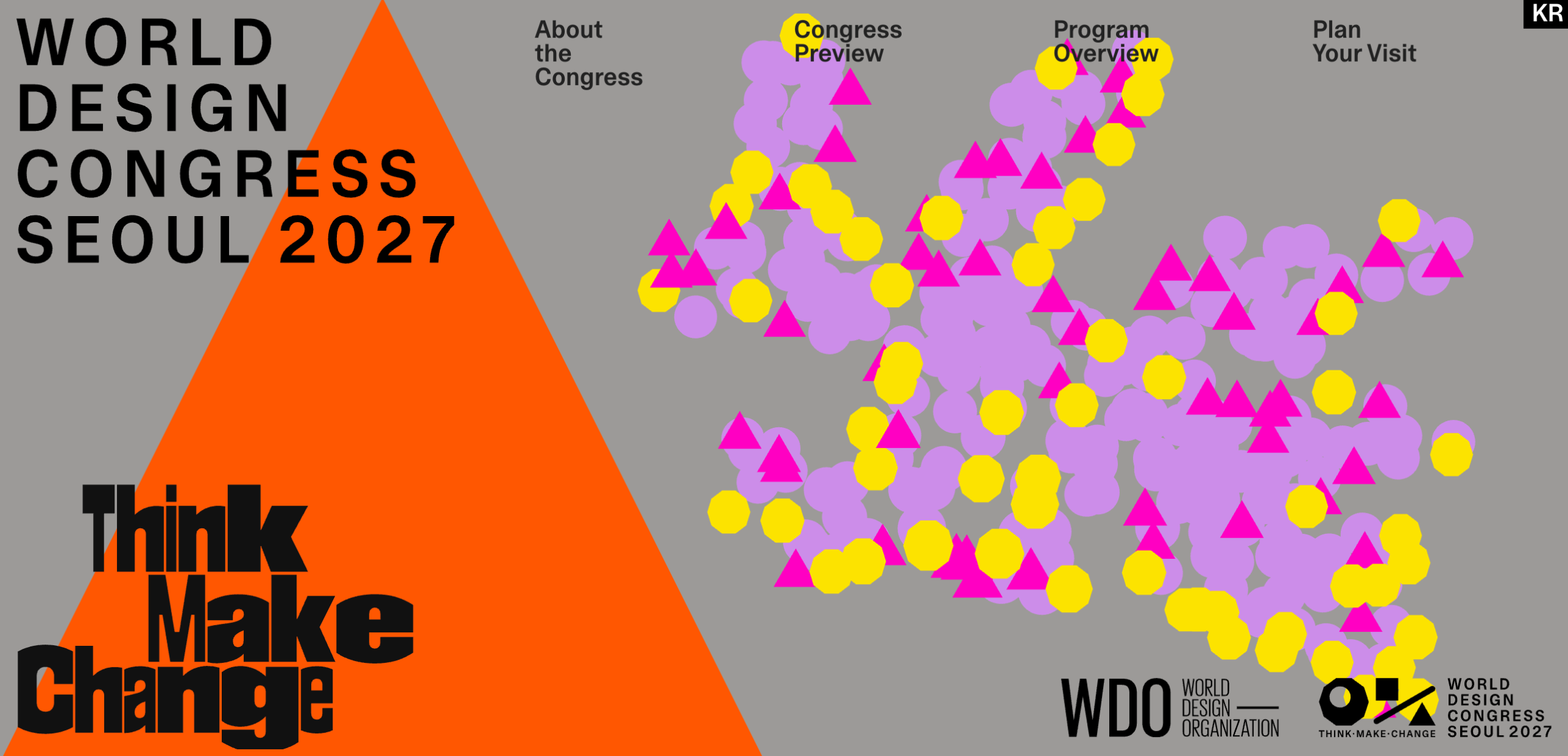
The "Seesaw" Logo: Stability in Motion
Perhaps the most striking element of the brand is the logo. It is a dynamic mark that appears to be in a state of constant equilibrium—or, as I like to think of it, a "seesaw mid-wobble." In a world of static, corporate logos designed to sit perfectly centered on a white business card, this logo is an act of defiance.
It signifies that design is not a static state of completion, but a continuous process of "Think, Make, and Change." By utilizing motion graphics to bring the logo to life, the identity acknowledges that in 2027, the digital experience is just as vital—if not more so—than the physical collateral.
Implications for the Future of Design Branding
The success of this identity holds significant implications for the wider design industry. For too long, organizations have succumbed to the pressure of "safe" branding. We have seen a decade of reductive rebrands where distinct visual personalities are flattened into uniform, minimalist icons. This "blanding" of design, often driven by the need to look good on a smartphone screen, has arguably made design less human and less engaging.
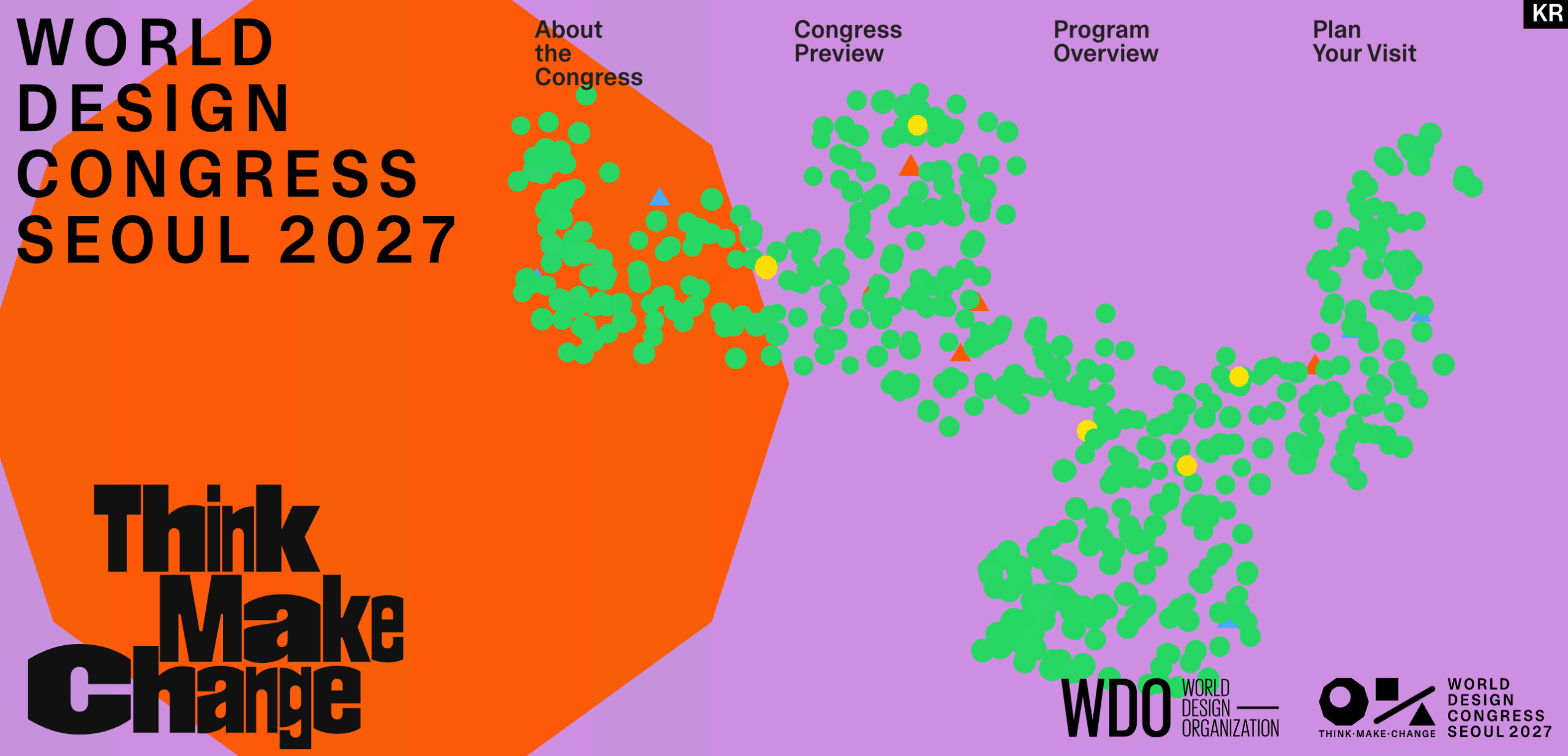
The World Design Congress 2027 proves that "bold and different" does not equate to "reckless." By rooting their maximalist approach in local context and logical systems, Everyday Practice has provided a roadmap for how large-scale institutions can reclaim their personality.
Why This Matters
- Breaking the "Focus-Group" Trap: When organizations allow designers to take risks, the result is more memorable and culturally resonant.
- Context Over Convention: The Seoul identity shows that branding works best when it tells a specific, place-based story rather than following global trends.
- The Role of Motion: As the world moves toward more immersive digital environments, the "static logo" is becoming an artifact of the past. The WDC identity embraces the kinetic nature of contemporary design.
Final Thoughts: A Masterclass in Maximalism
There is a lesson here for every creative director and design lead: you don’t have to be boring to be taken seriously. In fact, in a world saturated with beige, minimalist interfaces, being loud is an act of strategic intelligence.
Everyday Practice has managed to create a visual identity that feels as complex and layered as Seoul itself. They have avoided the trap of making the brand feel like a souvenir for tourists, opting instead to build an identity that feels like a living, breathing component of the city’s urban ecosystem.
As we look toward September 2027, the World Design Congress has already achieved one of its primary goals: it has started a conversation. By choosing an identity that is, by its own admission, a bit "weird," the WDO has signaled that it is ready to evolve. They have moved past the era of resting on their laurels, choosing instead to embrace the messy, beautiful, and vibrant reality of global design in the 21st century.
For those of us who have spent years writing about the same old trends, this is a welcome shift. It is a reminder that design is, at its heart, about communication—and sometimes, the most effective way to communicate is to stop whispering and start shouting in color.