
In the world of interior design, "color trends" are often treated as gospel, handed down by paint companies and design forecasters long before a single brush touches a wall. We are told what the "Color of the Year" is, which palettes are emerging, and which aesthetics will define the coming seasons. However, there has always been a significant disconnect between what the industry predicts and what homeowners actually choose.
To bridge this gap, the inaugural Samplize American Paint Color Report offers a rare, data-driven look into the "testing phase" of home renovation. By analyzing millions of paint samples ordered across the United States between 2024 and 2026—spanning industry giants like Benjamin Moore, Farrow & Ball, and Sherwin-Williams—the report bypasses marketing hype to uncover the true, unvarnished color preferences of the American public.
The Science of the Shortlist: How We Choose
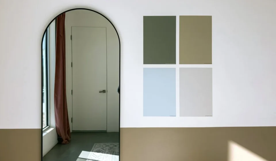
The premise of the report is simple yet revolutionary. Rather than looking at final sales data—which can be influenced by stock availability or regional supply chains—Samplize analyzed the samples homeowners ordered to test in their own lighting conditions.
"Analyzing this sampling stage reveals the full shortlist a person actually weighed, which colors get tested against each other, and how that shortlist spans brands," says Makenna Lutz, partnerships lead at Samplize.
By observing these side-by-side comparisons, the report provides a window into the consumer psyche. It reveals that homeowners are increasingly color-agnostic when it comes to brand loyalty, often placing a premium Sherwin-Williams sample next to a Farrow & Ball swatch to see which tone truly resonates with their space. This behavior confirms that the decision-making process is far more nuanced than a simple trend-following exercise.
Chronology of a Shift: The Great Warming
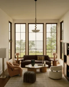
Over the three-year span of the study, one overarching trend emerged with undeniable clarity: the American home is getting warmer.
2024: The Early Indicators
At the start of the study period, the design landscape was still reeling from a decade of "cool-toned" dominance—specifically the "millennial gray" and stark, clinical whites that defined the 2010s. While cooling tones still held a significant portion of the market, the seeds of change were already being sown in early 2024 as homeowners began experimenting with subtle off-whites and warmer neutral undertones.
2025: The Acceleration
By the second year, the data showed a marked acceleration. The shift was not subtle. Warm colors began growing nearly three times faster than their cool counterparts. It became clear that this was not merely a temporary preference but a structural change in how Americans define comfort in their living spaces. By this point, 64.3% of all tested samples were categorized as "warm," a figure that would continue to climb.
2026: The New Normal
As of the most recent data, warm colors now account for 69.4% of all samples tested on the Samplize platform. Perhaps most telling is the polarization of the "shortlist": half of all American renovation projects are now considering only warm colors, completely excluding cool tones from their potential final choices. This suggests a definitive departure from the balanced, neutral palettes of the past, favoring an environment that feels inherently cozy and sun-drenched.
Supporting Data: Depth and Diversity
While it is easy to assume that "warming" equates to a move toward pale beige or cream, the data paints a more sophisticated picture. The most surprising finding in the report was the breakdown of color by depth.
Challenging the "Lightening" Myth
Industry experts often assumed that the movement toward warmth would manifest as a trend toward lighter, airier colors. However, the data reveals that warm colors outgrew cool colors across every depth level.
Deep, rich, and moody colors are not disappearing; they are simply changing their temperature. The deepest warm tones grew roughly six times faster than deep cool tones. This indicates that homeowners are not afraid of drama; they just want that drama to feel grounded in warmth rather than starkness.
The Rise of the "Muted Earth"
The report identifies a significant surge in brown-toned shades, which now appear in 13.4% of all shortlists, up from 9.2% just two years prior. However, these are not the saturated, heavy chocolates of the 1990s. Instead, we are seeing a preference for "muted" earth tones:
- Warm Stones: Such as Sherwin-Williams’ Warm Stone and Urbane Bronze.
- Complex Greiges: Including Benjamin Moore’s Smokey Taupe.
- Naturalistic Pigments: Farrow & Ball’s London Clay.
These colors act as a bridge, offering the grounded feel of brown with the versatile, neutral utility of gray.
Official Perspectives: The Temperature Matters
Makenna Lutz highlights that, for the modern homeowner, temperature appears to be the primary filter through which all other decisions are made. "Two-thirds of shortlists contain colors from only one temperature group," she notes.
This suggests that homeowners are approaching interior design with a clearer sense of the "vibe" they want to achieve. They are not looking to blend warm and cool tones; they are looking to create a singular, immersive environment. The fact that half of all shortlists are entirely warm indicates a strong commitment to a cohesive, cozy, and inviting home aesthetic.
Furthermore, the data suggests that the palette is diversifying. While neutral, warm tones are the primary drivers, there is a secondary growth in "pop" colors—specifically pinks and reds. These are appearing more frequently in samples, often paired with the aforementioned deep, warm neutrals, suggesting that homeowners are feeling more confident about introducing personality into their spaces.
Implications: What Does This Mean for the Future?
The Samplize report serves as a warning to those who believe trends are driven solely by top-down directives. The reality is that the American public is engaged in a bottom-up, trial-and-error process of design discovery.
The End of the "One-Size-Fits-All" Neutral
The days of the generic "greige" that fits everywhere are numbered. Today’s homeowner is looking for specific, complex undertones that respond to the unique lighting of their home. The shift toward warm, deep, and earthy tones indicates a desire for permanence and comfort in an increasingly volatile world.
The Role of Depth
The rapid growth of deep, warm tones—like Benjamin Moore’s Classic Burgundy—alongside soft, plaster-like pinks suggests that the market is bifurcating. We are seeing a move away from the middle-of-the-road "safe" colors. Homeowners are increasingly willing to choose either very soft, ethereal shades or deeply saturated, bold colors, provided they share a warm, inviting temperature.
A Note on Green
It is worth noting that green has successfully transitioned from a "trend" to a "staple." Holding steady at 34.6% of shortlists, green is no longer the new kid on the block. Whether it is a soft sage or a deep, moody botanical, green has become a permanent fixture in the American home, acting as the perfect natural partner for the rising warm-neutral palette.
Conclusion: A Warmer Future
The first Samplize American Paint Color Report does not offer a crystal ball, nor does it suggest that we have seen the last of cool-toned design. What it does prove is that the American aesthetic is currently in a state of intentional warming. We are moving away from the clinical and the cold, embracing a palette that feels human, natural, and profoundly cozy.
As we look toward the next few years, the data suggests that the successful designer—and the successful homeowner—will be the one who leans into these warm, complex, and deeply rooted tones. The "warm-and-deep" combination is not just a passing phase; it is a fundamental shift in how we want our homes to feel, signaling a move toward spaces that offer comfort, depth, and a sense of belonging.
Editorial Transparency: This article was developed with the assistance of AI tools, which may have been used for research, outlining, editing, or copy refinement. Reporting, fact-checking, and editorial decisions were made by the Design Milk editorial team.