
The Rise of the Quiet Interior: Why Sherwin-Williams Has Crowned "Celery" the 2027 Color of the Year

In the ever-evolving world of interior design, color trends often serve as a barometer for the collective cultural mood. Over the past few years, we have seen a dramatic preference for moody, dark, and saturated tones—forest greens, midnight blues, and rich charcoal hues that cocooned homeowners during uncertain times. However, as we look toward 2027, the design landscape is shifting toward a lighter, more ethereal aesthetic.
Sherwin-Williams and HGTV Home by Sherwin-Williams have officially unveiled their 2027 Color of the Year: Celery (SW 6421). This soft, herbal green, defined by its delicate yellow undertones, represents a departure from the heavy, high-contrast palettes of the recent past, favoring instead a sense of renewal, balance, and understated elegance.
Main Facts: The Anatomy of Celery
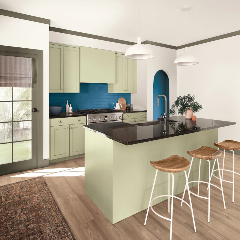
At its core, Celery is a sophisticated, nature-inspired hue that avoids the "neon" or "grass" connotations often associated with brighter greens. It is a muted, airy color that manages to feel both fresh and grounded. By incorporating subtle yellow undertones, Sherwin-Williams has created a shade that offers warmth—a critical element for those looking to make a home feel inviting rather than clinical.
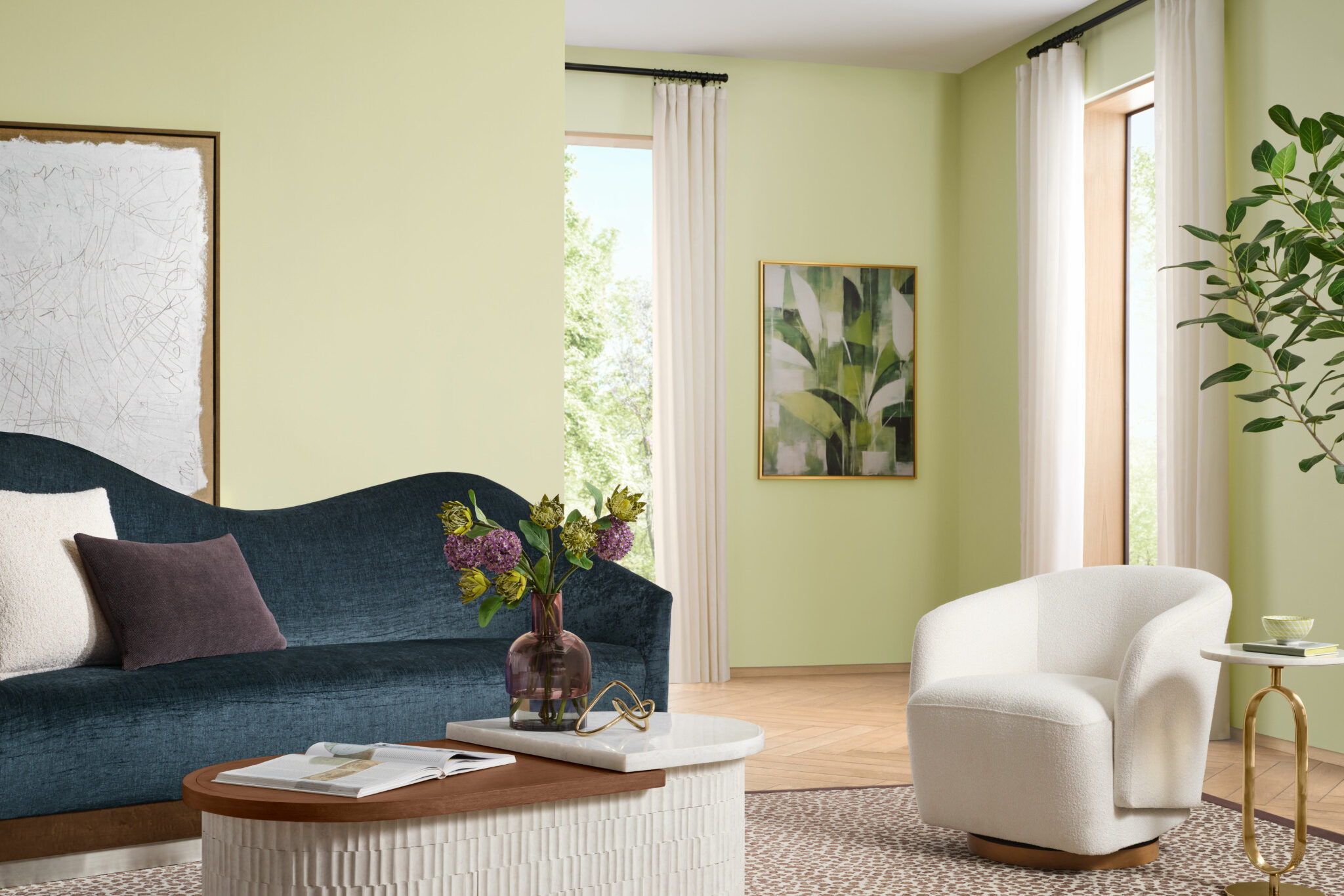
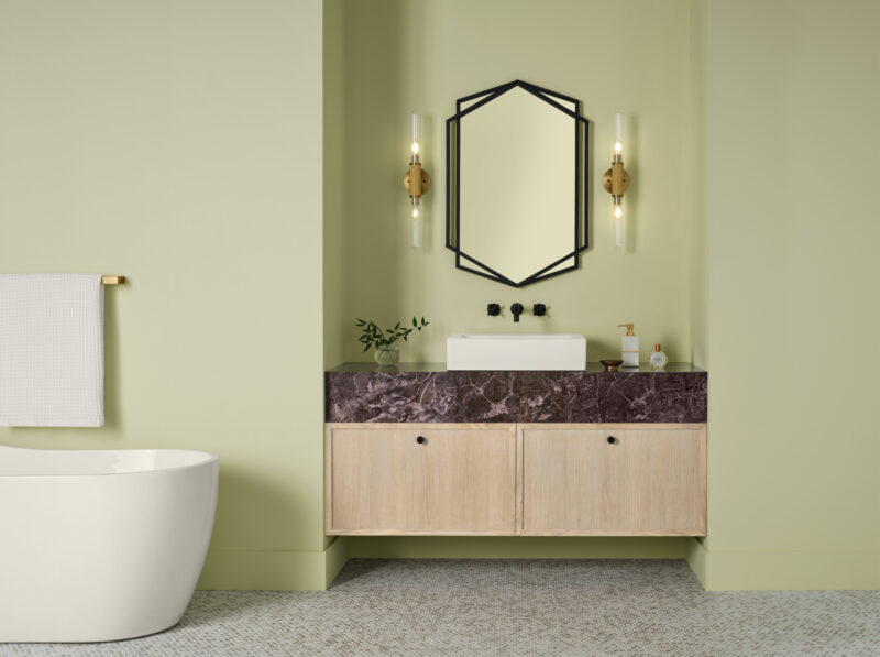
Unlike its bolder predecessors, Celery is designed to be versatile. It acts as a bridge between the vibrant botanical trends of the early 2020s and the desire for a cleaner, more minimalist future. It is a color that works effectively in high-traffic kitchens, serene primary bathrooms, or even as a calming backdrop in a busy living area. Its ability to remain "fresh without being vibrant" makes it an accessible entry point for homeowners who are wary of saturated color but are tired of the ubiquitous "greige" that dominated the early part of the decade.
A Chronological Shift in Color Trends
To understand the significance of Celery, one must look at the trajectory of color forecasting over the last five years.
The Era of "Cocooning" (2020–2023)
During the global shifts of the early 2020s, the design industry leaned heavily into colors that provided a sense of security. We saw the rise of deep, dramatic greens and warm, earthy terracottas. These colors were meant to turn homes into sanctuaries, creating "caves" of comfort.
The Transitional Period (2024–2026)
As the world began to open up, so did our color palettes. We moved toward a middle ground—mid-tone greens, soft blues, and muted earth tones. The focus shifted from "protection" to "connection" with the outside world.
The "Rewilding" Era (2027)
The selection of Celery is the hallmark of the Sherwin-Williams "Rewild" trend forecast. This movement prioritizes a lived-in, organic aesthetic. The trend is less about perfect, showroom-style interiors and more about spaces that feel like they have grown naturally over time. Celery fits perfectly into this philosophy, as it mimics the soft, unfiltered light of a morning garden rather than the engineered intensity of a synthetic pigment.
Supporting Data: The Science of Wellness at Home
The choice of Celery was not made in a vacuum. It was the result of extensive research by the Sherwin-Williams Trendsight Team. The data suggests that homeowners are no longer just asking, "What looks good?" but rather, "How does this space make me feel?"
According to Ashley Banbury, color marketing manager at Sherwin-Williams, the move toward wellness-centric design is the primary driver for 2027. "Homeowners and designers are increasingly prioritizing wellness at home, seeking soothing environments that support mental health and overall well-being," Banbury notes.
The color theory behind Celery supports this shift:
- Reduced Visual Noise: By opting for a muted, lower-saturation green, the brain experiences less visual fatigue.
- Circadian Alignment: The yellow undertones in Celery mimic the warmth of natural sunlight, which has been shown to improve mood and alertness compared to cooler, blue-toned greens.
- Biophilic Integration: As urban living continues to densify, bringing the outdoors in is no longer a luxury—it is a psychological necessity. Celery provides the easiest way to bridge that gap without requiring a massive architectural renovation.
Official Responses and Strategic Vision
The industry reaction to Celery has been one of quiet enthusiasm. Designers, who have long complained about the oversaturation of grey, see Celery as a breath of fresh air.
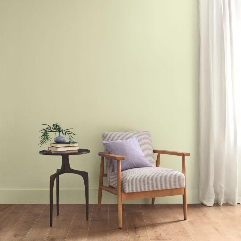
"Celery is the ‘Goldilocks’ of green," says one lead designer in the residential sector. "It isn’t so yellow that it looks like a kitchen from the 1970s, and it isn’t so deep that it makes a small room feel smaller. It’s exactly what the market needs: something that feels new, yet timeless."
The strategic partnership between Sherwin-Williams and HGTV Home by Sherwin-Williams (available at Lowe’s) ensures that this professional-grade color is accessible to the DIY market. This ubiquity is intentional; by placing the color in the hands of the average homeowner, the company is attempting to shift the national design narrative toward a more sustainable, nature-focused aesthetic.
Implications for Interior Design and Architecture
What does the arrival of Celery mean for your next renovation or refresh? The implications go far beyond a single coat of paint.
1. The Death of the "Feature Wall"
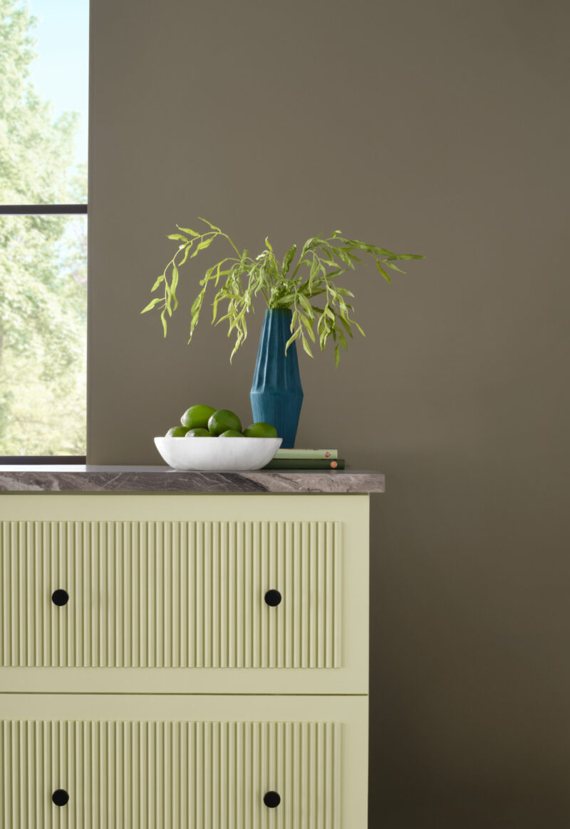
For years, we have seen the "one bold wall" strategy. Celery suggests a different approach: color drenching. Because the shade is so soft, it is ideal for painting ceilings, trim, and walls in a monochromatic fashion, creating a seamless, architectural look that makes a room feel larger and more cohesive.
2. A Shift in Materiality
The 2027 palette that accompanies Celery favors natural, raw materials. The inclusion of Minwax Pickled Oak (the 2027 Wood Stain of the Year) is a direct complement to this green. The combination of light, airy wood grains with the soft, herbal tones of Celery creates a Scandi-meets-Coastal aesthetic that is set to dominate home magazines for the next 24 months.
3. Contrast as an Accent
Sherwin-Williams has wisely curated a secondary palette that allows for experimentation. If you are not ready for a fully green room, the palette includes:

- White Flour & Woven Wicker: For those who want a neutral, organic backdrop.
- Artichoke & Georgian Bay: For those looking to add depth and "heft" to their design.
- Kirsch Red & Plum Brown: For the daring, these provide a "pop" that prevents the room from feeling too quiet.
4. The Move Toward Sustainability
"Rewilding" is not just an aesthetic; it is a philosophy. The use of Celery implies a desire to move away from fast-fashion design—where furniture and paint colors are swapped out annually—and toward items that feel "lived-in" and permanent. It encourages the use of vintage furniture, natural linens, and artisan-crafted ceramics.
Conclusion: A Quieter, Kinder Future
As we move toward 2027, the choice of Celery as the Color of the Year serves as a profound statement. It is a rejection of the high-octane, "Instagram-perfect" design era that prioritized spectacle over soul.
By choosing a color that mimics the humble celery stalk, Sherwin-Williams is inviting us to slow down. They are suggesting that the most powerful thing we can do for our homes is to create a space that offers us a moment of pause. Whether applied in a bustling kitchen or a quiet reading nook, Celery acts as a soft reminder of our connection to the natural world. It is a shade that does not scream for attention, yet, in its own gentle way, it demands that we acknowledge the importance of our own well-being.
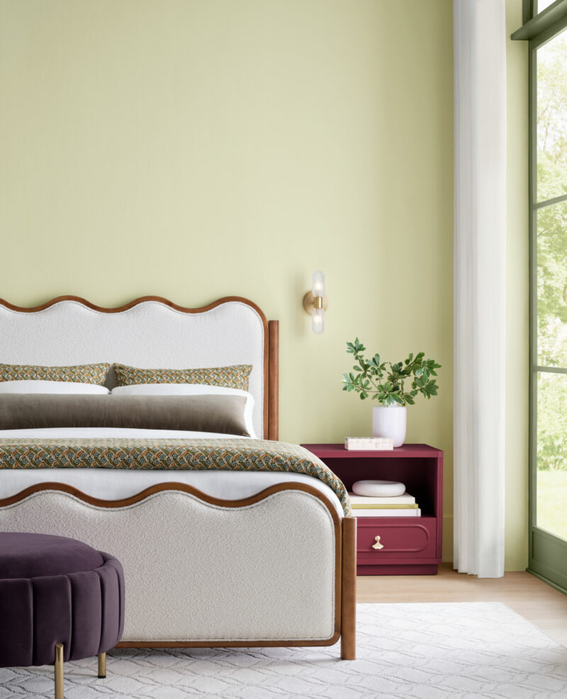
As you look to renovate or refresh your space in the coming years, consider what Celery represents: a move toward the authentic, the balanced, and the beautifully, quietly natural.
Celery is available as SW 6421 through Sherwin-Williams stores and as HGSW6421 through HGTV Home by Sherwin-Williams at Lowe’s. As with any paint selection, it is highly recommended that you test a sample in your own lighting conditions before committing to a full room, as the yellow undertones will shift significantly depending on whether your home receives morning or afternoon sun.