Beyond the Billboard: How Studio Coco Greenblum Redefined the Branded Environment in Aspen

In an era where brand activations are often synonymous with "Instagrammable" clutter—spaces designed solely to function as backdrops for social media feeds—the line between genuine hospitality and sterile advertising has become increasingly blurred. Most pop-up environments prioritize visual saturation, plastering logos across every available surface at the expense of human comfort.
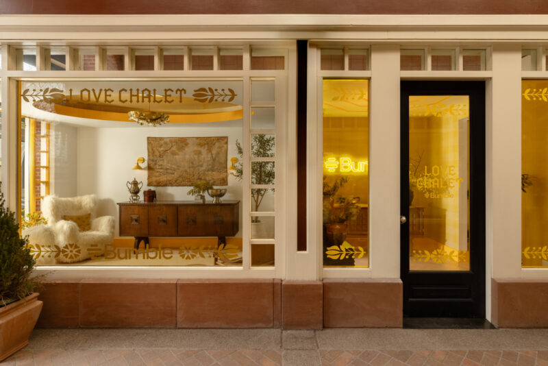
However, for Bumble’s seasonal "Love Chalet" in the heart of Aspen, Colorado, Studio Coco Greenblum challenged the industry’s status quo. By eschewing the typical "activation" playbook in favor of a residential design philosophy, the studio transformed a high-traffic, temporary space into an inviting, sophisticated mountain residence. The result serves as a compelling case study on how to bridge the gap between corporate identity and authentic human experience.
The Chronology of a Three-Week Transformation
The speed at which the Love Chalet materialized is perhaps its most impressive feat. Commissioned by the dating app Bumble to host a series of post-ski gatherings, high-level collaborations, and community events, the project was conceptualized, procured, and installed in a mere three-week window.
For many design firms, such a compressed timeline would necessitate a reliance on generic inventory or "safe" design choices. Yet, studio founder Coco Greenblum viewed the constraint as a catalyst for creative focus.
- Week One (Conceptualization): The studio prioritized a strong, cohesive narrative. Rather than listing requirements, the team defined the project’s emotional core: a space that felt like a well-traveled, intimate home.
- Week Two (Procurement and Curation): Shunning the usual mass-produced event furniture, the team sourced vintage European antiques, Murano glass lighting, and high-end textiles. This stage was defined by decisiveness, ensuring that every object served a purpose within the broader aesthetic framework.
- Week Three (Installation): The focus shifted to architectural integration. By treating the space as a permanent interior project rather than a temporary stage set, the team installed layers of lighting and texture that masked the "pop-up" nature of the site.
Greenblum notes that the aggressive timeline actually sharpened the studio’s point of view. "There wasn’t time to overthink every decision," she explains. "We focused our energy on creating a strong overall narrative through color, texture, and a few memorable moments. The decisiveness didn’t diminish the project; it strengthened it."
Navigating the Tension Between Brand and Place
One of the central challenges of the commission was navigating the clash between two distinct visual worlds: the bright, digital-first identity of Bumble and the deep-rooted, rustic heritage of Aspen.

A lesser design firm might have attempted a "literal" collision of these themes—perhaps placing a neon Bumble sign against a wall of fake antlers or buffalo plaid. Instead, Studio Coco Greenblum opted for a more nuanced approach, searching for the intersection between modern sophistication and mountain warmth.
The Architectural Strategy
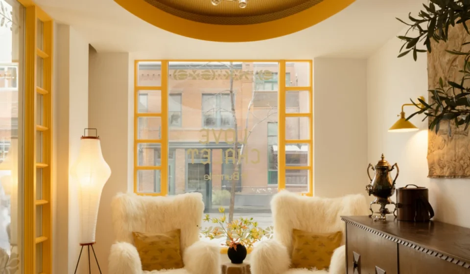
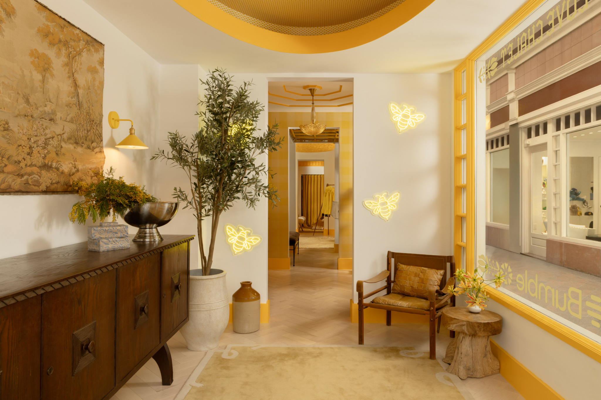
Instead of applying Bumble’s signature yellow as a graphic decal or a logo, the studio integrated the color into the architecture itself. By wrapping baseboards, doorframes, window surrounds, and ceiling details in the brand’s iconic yellow, the team created a rhythmic, structural language.
"The space had a series of long, narrow rooms," says Greenblum. "Applying the color architecturally helped unify the areas and create a sense of rhythm. It became a wayfinding device of sorts, but also added an unexpected playfulness that felt true to Bumble."

A Departure from Tropes
Critically, the design intentionally avoided the "cliché" Aspen aesthetic. There were no taxidermy displays, no heavy traditional plaids, and no predictable, rustic clichés. By opting for a sophisticated, collected interior—featuring pieces from Nordic Knots and carefully curated vintage casework—the studio evoked the feeling of a mountain home rather than a caricature of one.
Data and Composition: Building a "Collected" Home
The Love Chalet was a multifunctional space, housing hospitality, wellness, retail, and beauty services. To prevent the venue from feeling fragmented, the studio utilized a "residential language" to stitch these disparate programs together.
The Residential Blueprint
- Lighting: The use of Murano glass fixtures added an element of European elegance, moving away from the harsh, clinical lighting common in retail activations.
- Texture: Shearling seating, layered textiles, and natural wood finishes grounded the space, providing a tactile, sensory-rich environment that encouraged guests to linger.
- Continuity: By applying consistent architectural motifs throughout the floor plan, the studio allowed visitors to move from the retail area to the bar without feeling like they had entered a different zone.
"We approached the Love Chalet as if we were designing a home," Greenblum adds. "Each area had its own personality, but they all spoke the same language—like discovering different rooms within a beautifully collected home rather than moving through a branded event."
Official Perspectives on Experiential Design
The success of the Love Chalet highlights a growing shift in the marketing industry. As audiences become increasingly desensitized to traditional advertising, brands are finding that "content-first" spaces are failing to resonate on an emotional level.
When asked about the "social media moment," Greenblum remains pragmatic. While the project included custom neon installations and a "dripping honey" motif for photography, she argues that these moments only succeed when they are subservient to the larger spatial narrative.
"If a moment is memorable, beautifully executed, and contributes to the feeling of the space, it doesn’t have to sacrifice sophistication," she notes. "The goal is always to create experiences people genuinely connect with, not just backdrops for a photo."

Implications for the Future of Retail and Pop-Up Design
The Bumble Love Chalet is more than just a successful event installation; it is a blueprint for the future of "temporary" design. The industry is currently at a turning point where the quality of the environment is being measured against the standard of residential design rather than the standards of convention centers or trade shows.
Key Takeaways for Future Projects:
- Permanence in the Temporary: Using high-quality materials and vintage furniture in a pop-up setting elevates the perceived value of the brand.
- Architectural Branding: Integrating brand colors into the architecture (trim, moldings, structural elements) is more effective than surface-level signage.
- Human-Centric Flow: Designing for how a human being moves through a space—and how they feel while doing so—is the most effective way to drive brand loyalty.
- The "Anti-Cliché": Avoiding regional stereotypes allows for a more modern, global appeal that resonates with a wider audience.
Ultimately, Studio Coco Greenblum has demonstrated that a brand can be omnipresent without being overbearing. By focusing on the emotional resonance of the room, they proved that a space can be "branded" without becoming a billboard.
As the project closed, the feedback was clear: visitors were less impressed by the "photo-op" potential of the room and more captivated by the warmth and comfort of the environment. In the end, the Love Chalet achieved the rarest goal in marketing—it created a memory, not just a digital asset.

"We wanted it to feel collected, not staged," says Greenblum. "Branded environments can be imaginative without sacrificing warmth, authenticity, or good design. That is the new standard."