

In a stark reminder of the critical importance of brand oversight and visual sensitivity, global footwear icon Converse has been forced to retract a high-profile advertising campaign. The decision to scrub the materials from all digital and physical channels followed an immediate and intense public outcry, with social media users accusing the brand of deploying imagery that inadvertently evoked horrific, racially charged symbols.
The campaign, which featured K-pop superstar Karina, was intended to showcase the brand’s latest Chuck 70 X trainers. Instead, it became a lightning rod for criticism, sparking a nationwide conversation about the intersection of editorial photography, corporate negligence, and the legacy of historical trauma.
The Anatomy of a PR Crisis: The Imagery in Question
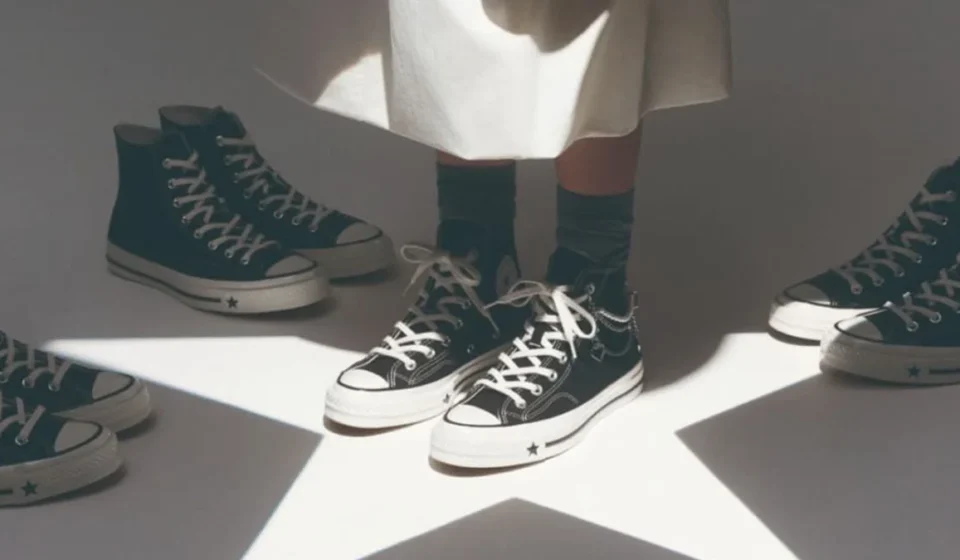
The controversy centers on a specific shot from the campaign featuring the K-pop idol posing with a pair of Converse sneakers. The composition, which likely aimed for a high-fashion, avant-garde aesthetic, utilized dramatic lighting and a projection of the iconic Converse star logo.
As the images began to circulate online, viewers quickly identified two specific visual elements that triggered the outrage. First, the projection of the star logo onto the artist’s white skirt created a sharp, triangular silhouette. Critics were quick to point out that this shape bore a striking resemblance to the hoods worn by members of the Ku Klux Klan—an association that immediately rendered the campaign toxic.
Furthermore, the framing of the shot compounded the problem. Because the image featured a cropped composition of the model’s torso, the placement of the sneakers—held loosely in her hand—led some observers to interpret the shoes as resembling the dangling feet of a lynching victim.
For many, the combination of these two elements was not merely a design error but a profoundly insensitive oversight that trivialized or evoked one of the most violent and traumatic aspects of American history.
A Chronology of the Outrage
The escalation of the crisis was rapid, typical of the speed at which modern digital discourse moves.
The Launch: Converse released the campaign featuring Karina as part of a strategic push to align the brand with influential global stars. Initial marketing efforts focused on the sleek, urban aesthetic of the Chuck 70 X line.
The Discovery: Within hours of the campaign going live, eagle-eyed users on platforms like X (formerly Twitter) began dissecting the composition. The first viral posts highlighted the lighting on the skirt, with subsequent threads pointing to the positioning of the sneakers.

The Viral Surge: By the second day, the hashtag #Converse began trending as users shared zoomed-in screenshots and overlays to illustrate why the imagery was being interpreted as racially insensitive. The consensus among critics was that, regardless of intent, the visual outcome was undeniably harmful.
The Retraction: Facing mounting pressure and calls for a boycott, Converse moved with unusual speed. By the end of the second day, the brand had removed the assets from its official social media channels and issued a formal statement to media outlets, acknowledging the gravity of the complaints.
Examining the Design Miscalculation
The incident raises significant questions regarding the production pipeline at major global brands. How does an image with such potentially offensive implications pass through the hands of photographers, art directors, editors, and brand managers without being flagged?
In modern advertising, "editorial" often seeks to push boundaries. Brands are increasingly eager to capture a "gritty" or "raw" aesthetic to resonate with younger, trend-conscious demographics. However, this push for visual impact often comes at the expense of rigorous sensitivity reviews.
Design experts have noted that the "triangular" shape created by the lighting is a classic example of "accidental iconography"—where the technical execution of a design unintentionally mirrors a symbol of hate. While the intent was clearly to project a brand logo, the failure to account for the shape’s secondary associations reveals a lack of diversity or historical awareness within the creative review process.
The Public and Professional Response
The reaction on social media was swift and unforgiving. "I cannot fathom why Converse would greenlight something so abhorrent," wrote one user on X. "Lynchings of Black people in the US is NOT ancient history, and brands have a duty to ensure their visual storytelling doesn’t lean into that imagery."
Others rejected the "innocent mistake" defense entirely. "It’s not just a shoe ad," one commentator noted. "When you are a brand of this magnitude, you have a global platform. With that comes the responsibility to filter your content through a lens of human decency and historical literacy. This was pure negligence."
Industry professionals have also weighed in, noting that this is not an isolated incident. In recent years, companies such as American Eagle have faced similar scrutiny for campaigns that were perceived as tone-deaf or culturally insensitive. The consensus among marketing consultants is that the current climate demands "hyper-vigilance." Modern audiences are more adept than ever at spotting problematic imagery, and the cost of a "miscalculation" is now significantly higher than it was even a decade ago.
Official Statement and Corporate Accountability
In response to the growing firestorm, Converse released a statement to People magazine, taking full responsibility for the error.

"We’re sorry," the statement read. "We understand why this image is deeply upsetting and recognize that we got this wrong. We removed it from our channels and are working to remove it everywhere it appeared. This should not have happened, and we will do better."
While the apology was direct and lacked the typical "corporate speak" that often characterizes such responses, it remains to be seen how the brand will adjust its internal review processes. For many, an apology is only the first step; the true test lies in whether the brand implements new safeguards to ensure that such a glaring oversight never happens again.
Broader Implications for the Advertising Industry
The Converse controversy serves as a case study for the risks inherent in modern advertising. As brands compete for attention in a saturated digital landscape, the urge to create "stunning" visuals can sometimes override the need for careful vetting.
1. The Need for Diverse Review Boards
Many analysts argue that if the team reviewing the images had been more diverse, the offensive nature of the composition would likely have been flagged immediately. When a homogeneous group of people reviews a campaign, they may share the same blind spots.
2. The Danger of "Style Over Substance"
The pursuit of a "stylized, editorial look" often leads to heavy manipulation of lighting and shadows. This incident highlights that technical skill—mastery of light, composition, and post-production—cannot replace the need for critical, contextual analysis of what is being depicted.
3. Long-term Brand Equity
Converse has long enjoyed a reputation as a "cool," accessible brand. While one campaign rarely destroys a company’s bottom line, it can erode the "trust capital" that brands spend years building. For a brand that thrives on its connection to youth culture and social expression, being associated with racist imagery is a particularly damaging blow.
Conclusion: A Lesson in Vigilance
As we move further into an era of hyper-aware consumption, the threshold for what constitutes acceptable advertising has shifted. It is no longer enough for a brand to claim that their intent was "innocent." In the court of public opinion, the impact of the imagery is what matters most.
The Converse incident is a sobering reminder that in the creative world, intent is secondary to perception. For brands looking to avoid the same fate, the path forward is clear: integrate rigorous cultural sensitivity training into the design phase, diversify the voices in the room, and always pause to consider what a design might look like to a viewer who doesn’t share the creator’s perspective.
Ultimately, this debacle serves as a cautionary tale for the industry: the most expensive, highly produced campaign in the world can be undone in an instant by a single, unchecked image.