The “Mexiconteiners” Revolution: How a Household Habit Became a Masterclass in Brand Design

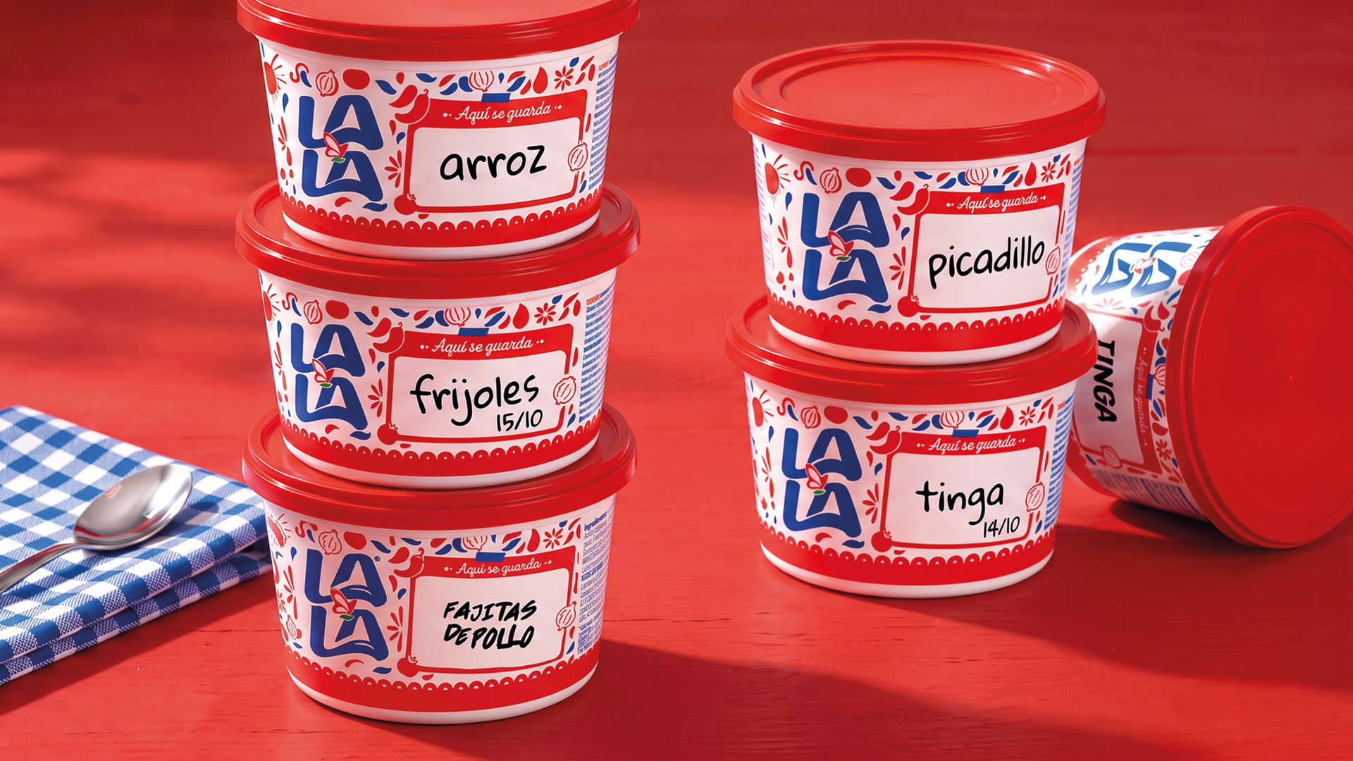
In the landscape of modern consumer goods, packaging is typically designed for a singular, linear journey: from the shelf, to the home, to the trash bin. However, for decades, millions of households across Mexico have quietly subverted this narrative. In a phenomenon as ubiquitous as it is humorous, the sturdy, white plastic tubs used by the dairy brand Lala for its table cream have been systematically repurposed. Rather than housing cream, these containers often reveal, upon inspection, a treasure trove of leftovers: beans, salsa, tinga, or rice.
This "fridge Russian roulette"—the act of opening a tub expecting dairy and finding dinner remains—has long been the subject of cultural memes and lighthearted frustration. Recently, however, this informal domestic ritual was elevated from a private joke to a brilliant piece of industrial design. Through the "Mexiconteiners" project, Lala has officially acknowledged the secondary life of its packaging, transforming a cultural quirk into a viral, sustainable, and highly effective branding success story.
The Genesis: Observation Over Focus Groups
The brilliance of the "Mexiconteiners" initiative lies in its simplicity. It did not emerge from a boardroom of marketing analysts conducting expensive, multi-year consumer research. Instead, it was born from the lived reality of the Mexican consumer.
Diego Gueler Montero, Chief Creative Officer at the creative agency Zurda México, explains that the project was a "lightbulb moment" derived entirely from shared cultural experience. "You don’t need a focus group or a massive research study for this; you just need to have grown up in Mexico," he notes. The creative teams at Zurda México and Conciergency observed a universal truth: the Lala tub was already a staple of the Mexican kitchen’s organizational system. By recognizing this, the agencies saw an opportunity not to change consumer behavior, but to validate and improve it.
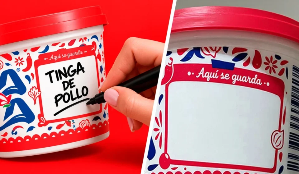
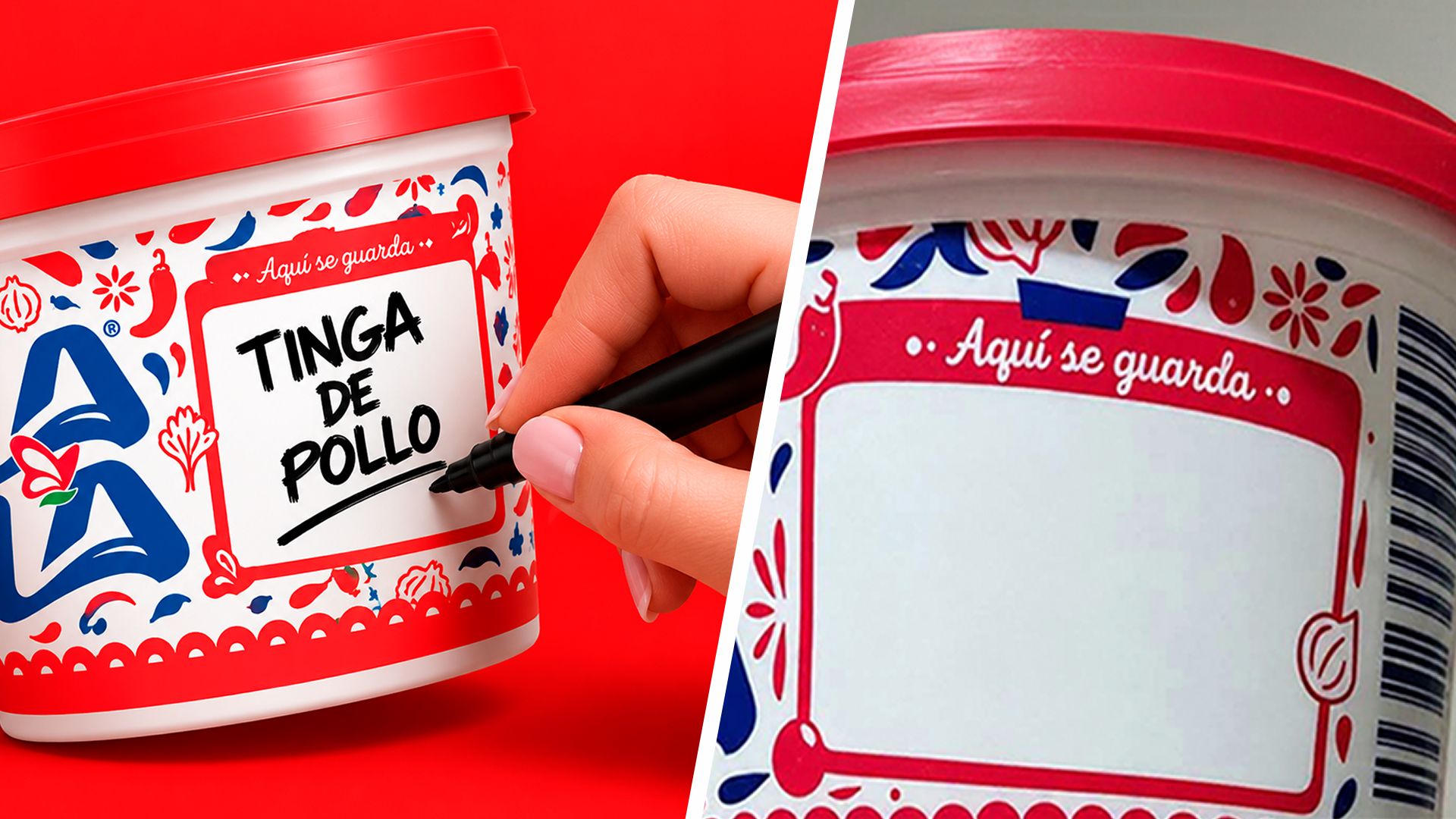
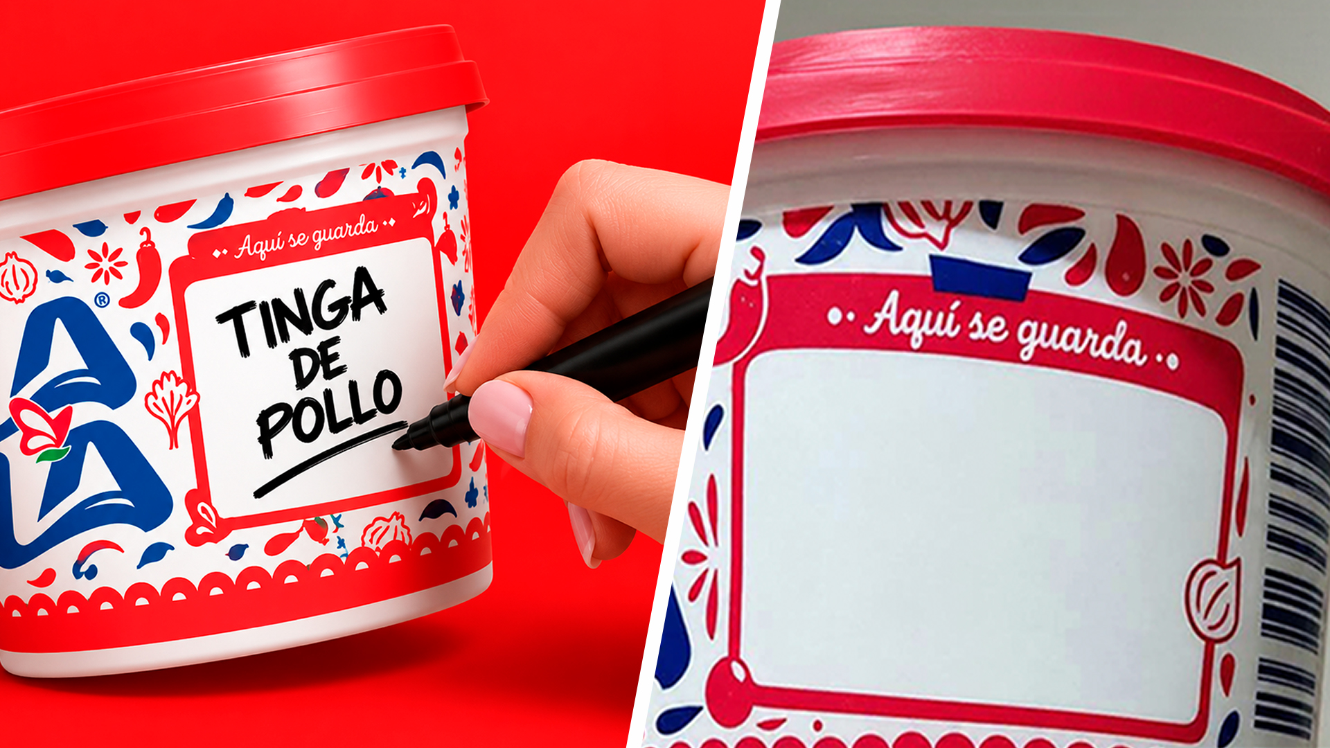
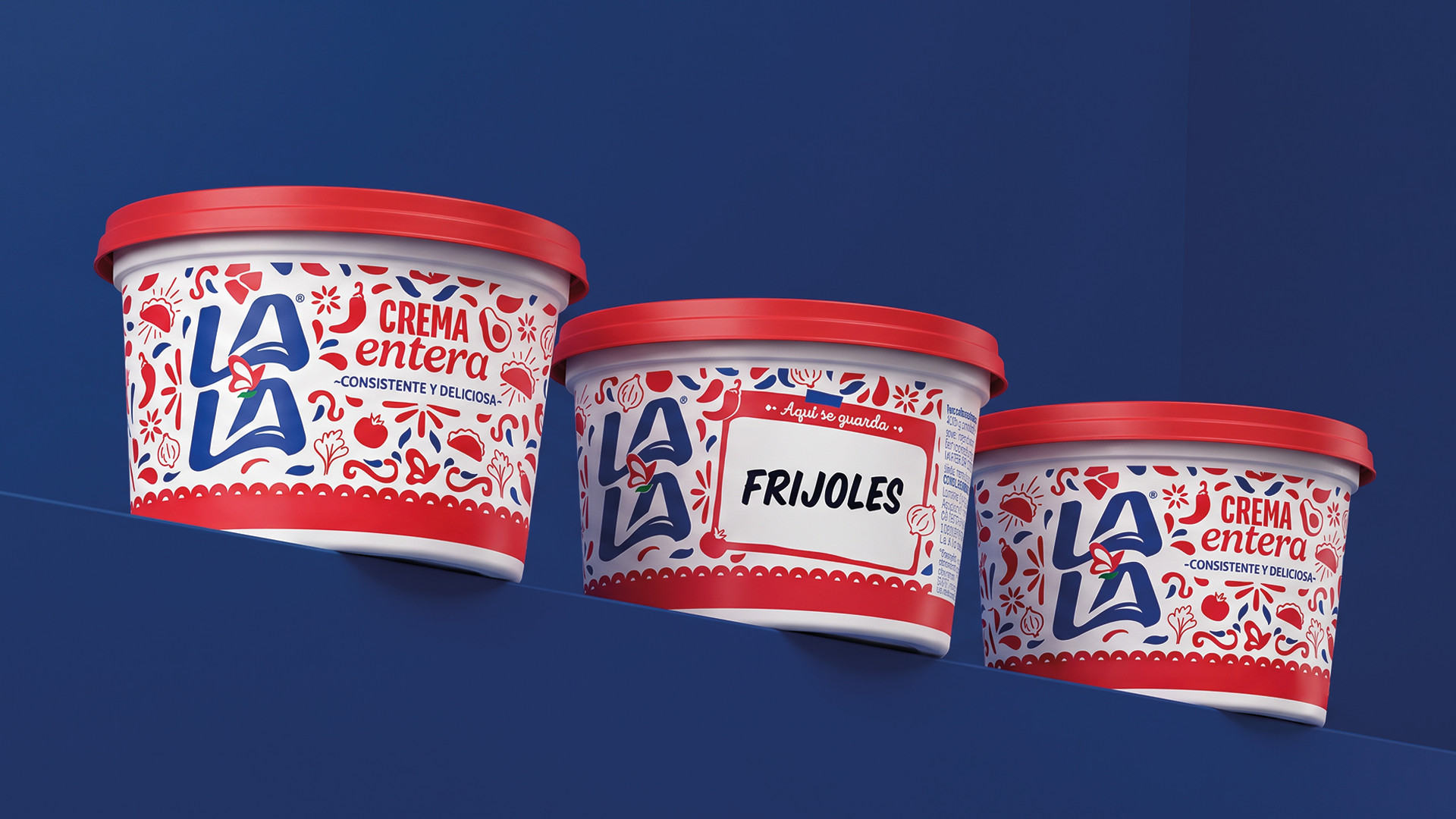
The project was a proactive intervention, designed to lean into the brand’s deep-seated presence in the home. By adding a designated, writable space on the label—a clear, white field where users can label the contents of their reused containers—Lala transformed a "hidden" habit into an official brand feature.
Chronology of a Cultural Shift
The evolution of the Lala container from a mere dairy vessel to a multi-purpose storage solution has been a slow-burn process spanning decades, but its formalization as a design project followed a rapid, calculated timeline:
- The Decades of Habituation: For years, the durability and size of the Lala cream tub made it the ideal storage vessel for the average Mexican family. Its shape, lid-tightness, and capacity rendered it a permanent fixture in refrigerators across the country.
- The Rise of Digital Folklore: As social media became the primary venue for cultural commentary, the "Lala container surprise" became a recurring meme. These digital jokes cemented the idea in the public consciousness as a shared, uniquely Mexican experience.
- The Strategic Conceptualization: Recognizing the power of this narrative, agencies Zurda México and Conciergency approached the brand with the "Mexiconteiners" concept. The proposal was to stop fighting the behavior and instead embrace it.
- The Design Integration: Designers worked to ensure that the "writable space" feature did not alienate the original product. The challenge was to maintain the iconic Lala identity while subtly introducing a functional space that felt native to the packaging.
- The Public Launch: When the new design hit shelves, the reception was instantaneous. It validated the consumer’s behavior, turning a "hack" into an authorized, branded activity.
- Expansion: Following the initial success, the platform began to evolve, moving beyond plain labeling into licensed editions, including collaborations with iconic properties like Peanuts.
Supporting Data and the Psychology of Reuse
Why does this specific design intervention resonate so strongly? At its core, the project succeeds because it bridges the gap between industrial design and human behavior.
In the field of sustainable design, the "second life" of packaging is often a goal that brands fail to reach. Companies spend millions trying to convince consumers to recycle or upcycle, often with little success. Lala, however, bypassed the "convincing" stage entirely. The consumers were already reusing the packaging; the company simply provided the tools to do it better.
Psychologically, this creates a sense of brand intimacy. By acknowledging the "fridge Russian roulette," Lala signaled that it is a brand that listens to its customers and lives in their homes. It is a form of brand humility that is increasingly rare in the corporate world. When a company acknowledges its product’s flaws—or in this case, the chaotic reality of its consumers’ storage habits—it builds a level of trust that a traditional advertising campaign could never replicate.
Official Responses and Design Philosophy
The creative leads behind the project emphasize that the goal was never to "rebrand" the container, but to "re-contextualize" it.
"We realized we didn’t need to push the product itself; we needed to celebrate the container’s second lifecycle," says Diego Gueler Montero. This shift in focus is a critical lesson for modern marketers. By moving from a product-centric model to a consumer-centric one, Lala successfully turned a disposable item into a "permanent cultural asset."
Valentina Zuchiatti, Chief Creative Officer at Conciergency, highlights the difficulty of the design process. "The challenge was to make that new function feel completely integrated into the brand," she explains. "We incorporated illustrations and graphic codes rooted in Mexican culture and everyday life… while keeping the pack unmistakably Lala."
This integration is crucial. Had the design looked like an add-on or a generic sticker, it would have lost its charm. By making the writing area an aesthetic part of the label, the design team ensured that even when the container is repurposed, it still carries the brand’s visual equity. It remains a "Lala" container, even when it is holding someone’s grandmother’s secret salsa recipe.
Implications for the Packaging Industry
The "Mexiconteiners" project carries significant implications for the future of sustainable and consumer-focused packaging design:
1. Embracing Informal Consumer Behavior
Brands often attempt to control how their products are used. The Lala example proves that there is immense value in observing and supporting how consumers actually use products. When a brand validates a user’s organic habit, it creates a powerful emotional connection.
2. Redefining Sustainability
Sustainability is frequently discussed in terms of biodegradable materials or recycling streams. However, extending the life of a product through utility—essentially delaying its journey to the waste bin—is a highly effective form of sustainability. The Lala tubs were already being reused; the addition of a labeling space simply increases the likelihood that they will be reused for longer, further delaying the need for new plastic storage containers.
3. The Shift to "Flexible Platforms"
As noted by the creative team, the success of the original "Mexiconteiners" allowed it to evolve into a flexible design platform. By using the container as a canvas for licensed collaborations (like Peanuts), the brand has turned a functional object into a collectible one. This indicates that packaging can serve as an ongoing creative medium rather than a static wrapper.
4. Cultural Relevance as a Competitive Advantage
In a saturated market, cultural relevance is the ultimate differentiator. Lala did not just sell dairy; it sold a piece of the Mexican identity. This makes the brand difficult to displace, as it has woven itself into the fabric of the home. Future design initiatives should look for these "cultural friction points"—the small, recurring problems in everyday life—and find creative ways to provide a solution that feels both helpful and authentic.
A Lasting Legacy
The "Mexiconteiners" campaign is a testament to the power of design to transform the mundane into the memorable. It serves as a reminder that the best brand innovations are often those that require the least amount of explanation.
By simply asking the question, "What’s inside?", Lala transformed a messy, chaotic, and often frustrating kitchen habit into a point of connection. It is a rare example of a corporation succeeding by letting go of control and inviting the consumer to participate in the design process.
As the project continues to evolve, the lesson remains clear: the most effective packaging design is that which acknowledges the reality of the home. When a brand stops trying to be the "hero" of the consumer’s kitchen and instead becomes a helpful, observant partner, it secures its place on the shelf—and in the fridge—for generations to come. The "Mexiconteiners" are no longer just cream tubs; they are the vessels of family tradition, a symbol of creative reuse, and a definitive example of how smart design can solve a universal, if quirky, human problem.