Comments Off on The Anatomy of Conversion: Why Event Professionals Are Rethinking the Registration Form
GLOBAL — In the high-stakes world of modern event marketing, organizations invest countless hours and substantial budgets into multi-channel campaigns. From targeted social media advertisements and email sequences to high-profile speaker announcements and promotional videos, every strategic effort shares a singular destination: the event registration page.
Yet, according to recent industry analyses, a critical oversight continues to plague event teams worldwide. Organizers frequently spend more time curating the event itself than optimizing the digital gateway designed to capture attendee commitments. The result? High visitor traffic colliding with poorly optimized, friction-heavy sign-up portals—a bottleneck that quietly drains potential revenue and attendance numbers.
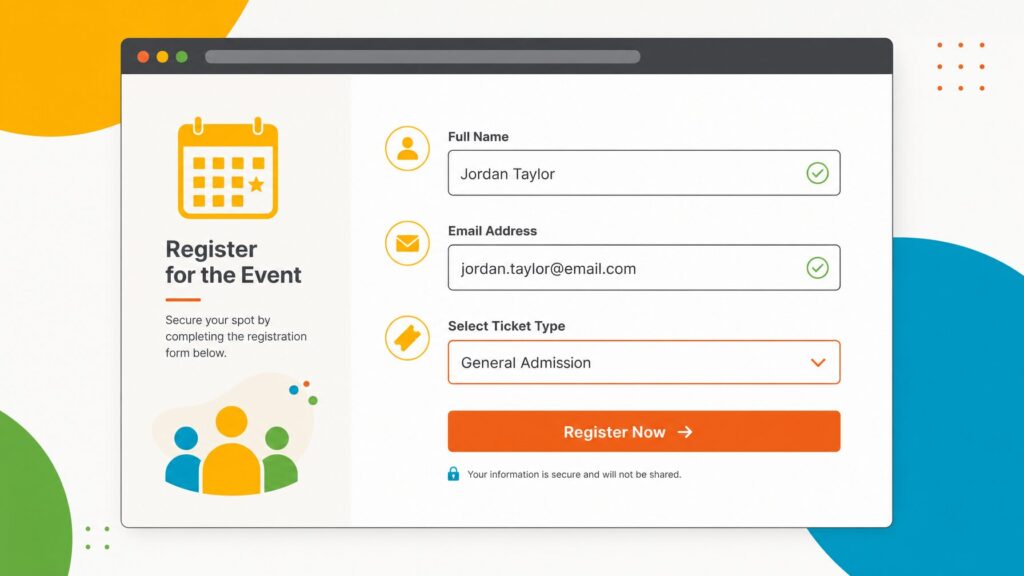
Industry veterans emphasize that a registration form is far more than a simple administrative tool. Serving as the primary data collection point for contact details, ticket selections, payment processing, and logistical preferences, it represents the very first operational touchpoint an attendee experiences as a participant rather than a passive browser.
Chronology of the Modern Registration Paradigm
To understand how event registration forms evolved into critical marketing infrastructure, one must examine the shifting digital landscape of the past decade.
The Static Era (Early 2010s): Event sign-ups were largely static, standalone PDF downloads or rudimentary, unstyled HTML boxes. Data collection was treated as an afterthought, requiring manual data entry and heavy spreadsheet reconciliation.
The Disconnected Digital Boom (Mid-to-Late 2010s): As dedicated event websites emerged, forms became digital. However, they remained siloed. Organizers relied on disparate third-party form builders that did not communicate with event apps, badge printers, or email marketing software, leading to massive administrative overhead.
The Integrated Conversion Era (Present Day): Today, registration is recognized as the nucleus of the event marketing funnel. Modern platforms leverage advanced conditional logic, seamless cross-platform data synchronization, and mobile-first architecture to drastically cut cart abandonment and streamline post-submission workflows.
Supporting Data: The Cost of Friction
Quantifying the impact of registration design reveals stark metrics for event planners:
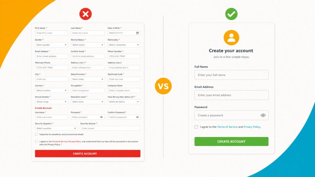
The Sweet Spot for Length: Forms maintaining an ideal range of 5 to 8 fields consistently yield the highest completion rates across both B2B and consumer events.
The Abandonment Threshold: Digital registration forms that stretch past 10 to 12 fields experience a dramatic, exponential surge in user abandonment. Every unnecessary question introduces a new barrier to conversion.
Mobile Traffic Dominance: With a steadily climbing majority of registrants initiating and completing sign-ups via smartphones and tablets, non-responsive mobile layouts have become a primary driver of lost ticket sales.
Official Insights: Streamlining the Attendee Journey
Event technology experts and UX designers stress that simplicity and relevance are paramount when constructing high-converting registration workflows.
The Essentials vs. The Excess
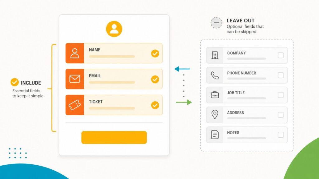
At its core, every effective registration form requires only first and last names, a validated email address, and a clear ticket type selection. Beyond these non-negotiables, organizers must ruthlessly audit additional fields.
"Before adding any field, ask one fundamental question: Will you actually use this data for event logistics, badge printing, communications, sponsors, or post-event reporting? If the answer is no, remove it," advise platform usability specialists.
Common optional fields—such as job titles, organizational affiliations, phone numbers, and dietary or accessibility requirements—should only be deployed when directly relevant to the event’s operational scope.
Leveraging Conditional Logic to Erase Friction
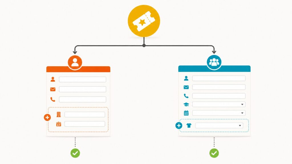
One of the most significant technological leaps in modern form architecture is the integration of conditional logic (often referred to as if/then rules). Rather than forcing every visitor to scroll through an exhaustive list of irrelevant questions, dynamic forms display or hide fields based on previous inputs.
For instance, if a registrant selects a "VIP" ticket tier, the system can automatically reveal targeted prompts for preferred session tracks or exclusive networking breakfasts. Meanwhile, general admission attendees bypass these fields entirely. This mechanism prevents user fatigue while ensuring organizers capture precise, segmented data without duplicating administrative work.
Strategic Implications for Event Teams
The implementation of a streamlined, intelligent registration form echoes across the entire lifecycle of an event, redefining operational efficiency.
1. The Death of Manual Data Entry
When a registration form operates within an isolated environment, event teams face a mountain of manual labor—exporting CSV files, formatting data for badge printers, and manually segmenting email lists. In contrast, fully integrated ecosystems allow registration data to flow effortlessly and instantly into attendee profiles, onsite check-in terminals, and communication hubs.
2. Immediate Personalization and Marketing Attribution
Real-time data synchronization empowers marketing teams to launch hyper-targeted email campaigns based on exact ticket tiers or custom responses collected at sign-up. Furthermore, understanding precise referral channels enables organizers to calculate return on investment (ROI) with unprecedented accuracy.
3. Setting the Tone for the Brand Experience
Because the registration form is the inaugural participatory experience of the event, its usability dictates participant sentiment. A fast, intuitive, mobile-optimized check-out process communicates professionalism, organization, and respect for the attendee’s time, establishing high expectations for the live event itself.
Best Practices for Building a High-Converting Form
Event organizers looking to maximize sign-ups and protect revenue streams are advised to follow a rigorous design and testing protocol:
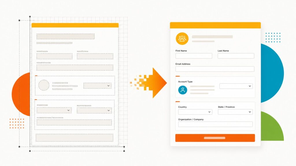
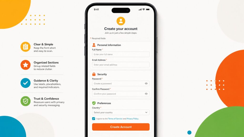
Organize into Logical Sections: Break up long sequences using clear section headers (e.g., Personal Details, Ticket Selection, and Event Preferences) to create a visual sense of progression.
Ensure Crystal-Clear Labeling: Eliminate ambiguity by separating "First Name" and "Last Name" fields and clearly identifying organization names.
Demystify Pricing: For paid events, display all ticket costs, tier benefits, and associated fees transparently upfront to prevent last-second cart abandonment.
Mandatory End-to-End Testing: Always complete a full test registration using a live email address before public launch. Verify confirmation email delivery, payment gateway functionality, and database synchronization. Most importantly, have an independent colleague test the form unguided to uncover hidden UX friction points.
By treating the registration form not as a static administrative hurdle, but as the critical conversion engine of the entire event marketing strategy, organizers can significantly boost attendance, eliminate logistical errors, and deliver an exceptional user experience from the very first click.