
The Architecture of Energy: How SOA Architekti Redefined Korean Street Food in Prague

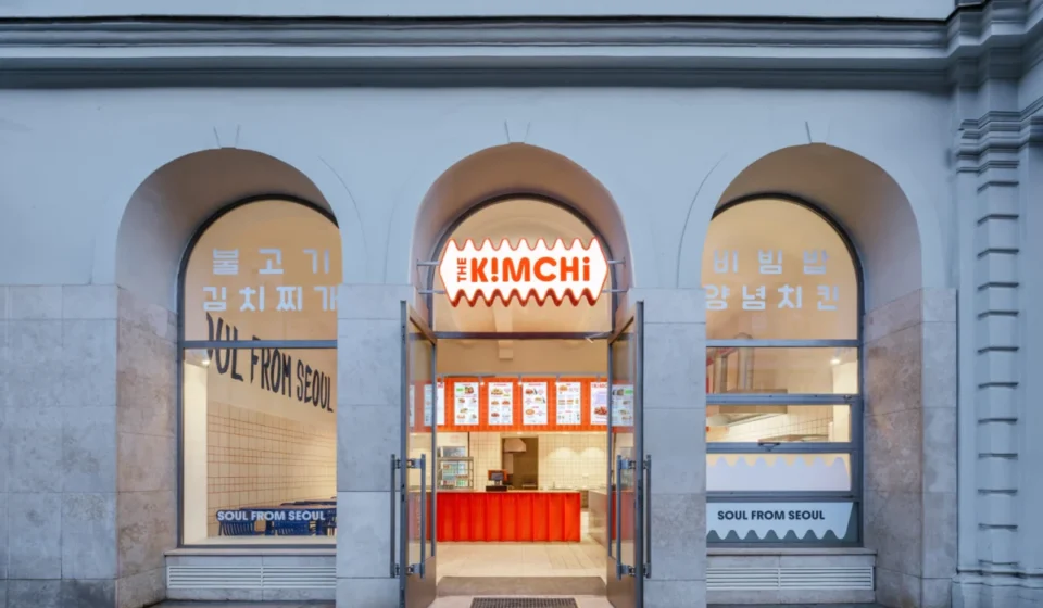
In the heart of Prague, nestled beside the bustling transit artery of the Masaryk Railway Station, a new culinary destination has emerged that challenges the traditional aesthetic vocabulary of the "ethnic restaurant." The Kimchi, a compact 1,453-square-foot eatery, is not merely a place to enjoy traditional Korean street food; it is a masterclass in spatial branding and architectural restraint. Designed by the visionary team at SOA architekti—led by Štefan Šulek and Matěj Štěcha—the project eschews the predictable, cliché-heavy tropes often associated with cultural dining spaces in favor of a bold, abstract interpretation of contemporary Seoul.
Main Facts: A Convergence of Culture and Design
Completed in 2026, The Kimchi is the realization of a husband-and-wife team’s ambition to bring authentic, vibrant Korean flavors to the Czech capital. Rather than leaning on literal cultural markers—paper lanterns, dark woods, or traditional folk motifs—SOA architekti sought to translate the energy of South Korea into a physical environment.

The restaurant occupies the bones of a former pastry shop, a history the architects chose to respect while completely recontextualizing the interior volume. The resulting space is defined by a rigorous, high-contrast visual language where architecture and graphic identity are indistinguishable. The project relies on a "singular gesture"—a fluid, wave-like form that snakes from the exterior signage into the interior, connecting the serving counter to the wall surfaces. This movement, developed in close collaboration with graphic designer Tomáš Eisner, serves as the project’s central narrative thread.
Chronology: From Concept to Culinary Landmark
The project’s development followed a rigorous, integrated timeline, marking a departure from the traditional "design-then-brand" sequence.

- Early 2025 (Inception): The Korean owners approached SOA architekti with a vision to create a modern, street-food-focused space. The brief emphasized authenticity in food but left the spatial expression open to interpretation.
- Mid-2025 (Integrated Design Phase): Recognizing that the small, narrow footprint of the former bakery could easily become cluttered, SOA architekti and Tomáš Eisner began the design process simultaneously. This was crucial; by co-developing the graphic identity and architectural layout, they ensured that the "wave" motif would be woven into the structure itself rather than applied as a decorative afterthought.
- Late 2025 (Refinement): The team moved from the abstract taegeuk symbol—the core of the South Korean flag—toward a more stylized, abstract wave. This period saw the selection of the specific color palette: a saturated, electric blue and a bold, industrial orange, anchored by white ceramic tiles.
- Early 2026 (Construction): The renovation of the Masaryk-adjacent site began, retaining the shell of the original pastry shop while introducing new spatial hierarchies.
- September 2026 (Opening): The Kimchi opened its doors, signaling a new era for local street-food culture where architectural sophistication meets casual dining.
Supporting Data and Materiality: The Power of Contrast
The success of The Kimchi lies in its granular attention to material detail. In a space where every square inch is accounted for, the architects utilized color and texture to define zones and create the illusion of expanded space.
The Role of Color
The palette is intentionally aggressive, mirroring the intensity of a Seoul street market.

- Electric Blue: This shade acts as the primary connective tissue, coating tables, bench seating, wall finishes, and lighting fixtures. It serves as a cool counterpoint to the heat of the kitchen and the spices of the food.
- Graphic Red Grout: Perhaps the most daring choice in the project is the use of red grout between white ceramic wall tiles. This "modest intervention," as described by Štefan Šulek, transforms a standard, inexpensive material into a cohesive, high-energy grid that ties the walls to the red-toned branding elements found throughout the restaurant.
- Textured Orange Mesh: Suspended above the serving counter, the orange mesh provides a tactile, three-dimensional element that breaks the flat surfaces and adds depth to the service area.
Spatial Efficiency
The layout addresses the challenges of a narrow, elongated footprint through a mix of seating typologies. By avoiding a uniform seating arrangement, the architects provided a range of experiences:
- Window Perches: Ideal for solo diners or those watching the city pulse by.
- The Communal Concrete Table: A social focal point that anchors the center of the space.
- Intimate Benches: Maximizing wall space to keep the floor plan open and navigable.
Official Responses: The Philosophy of Restraint
In discussions regarding the design philosophy, the architects at SOA architekti have been vocal about their refusal to engage in cultural mimicry.

"We wanted the Korean identity to be present without turning the restaurant into a collection of obvious references," explains Štefan Šulek. "What interested us was less the imagery of Korea and more its visual energy—the intensity of color, contrast, graphics, food culture, and contemporary Seoul."
This philosophy was driven by a desire for operational honesty. The team realized that in a high-turnover street food environment, the design must support the choreography of service. The kitchen is designed as a stage; the final assembly of dishes happens at the counter, allowing diners to witness the "theatre" of preparation. This transparency is an architectural extension of the "open kitchen" concept, ensuring that the ritual of cooking remains the primary focus of the visitor experience.

Implications: The Future of "Cultural" Interior Design
The Kimchi serves as a case study for how small-scale commercial projects can punch above their weight through the intelligent integration of graphic design and architecture.
Challenging Ethnic Tropes
The project signals a shift in the hospitality sector. As global cuisines continue to gain popularity in European cities, there is a growing fatigue regarding "theme-park" interiors that rely on cultural clichés. By opting for abstraction, SOA architekti suggests that a culture’s identity is better communicated through intensity and atmosphere than through symbols or artifacts.

The Architect-as-Curator
The collaboration between SOA architekti and Tomáš Eisner highlights the necessity of interdisciplinary work. By treating the signage, the wall grout, the furniture color, and the spatial flow as a single, unified project, they achieved a level of cohesion that is rare in small-budget renovations. The "wave" is not just a sign; it is a structural guide that dictates how a customer moves through the space.
Economic and Urban Context
Situated at the Masaryk Railway Station, the restaurant serves a transient, fast-paced demographic. The design respects this speed while offering a sanctuary of refined aesthetics. The use of inexpensive, "generic" materials like white tiles, when elevated by creative grout work and bold color choices, demonstrates that high-end design is not necessarily dependent on high-end materials—it is dependent on high-end thinking.

In conclusion, The Kimchi stands as a testament to the fact that when architects treat branding not as an accessory but as a foundation, the result is a space that feels both timeless and urgent. It is a bold, blue-and-orange landmark in Prague that captures the spirit of Seoul not by looking like it, but by feeling like it—kinetic, sharp, and undeniably alive.