

In the high-stakes world of professional sports branding, history is often treated as a goldmine for nostalgia-driven marketing. Teams frequently dig into their archives to revive vintage aesthetics, aiming to connect with long-term fans and monetize the "throwback" trend. However, for the Atlanta Falcons, this strategy has backfired—not once, but twice.
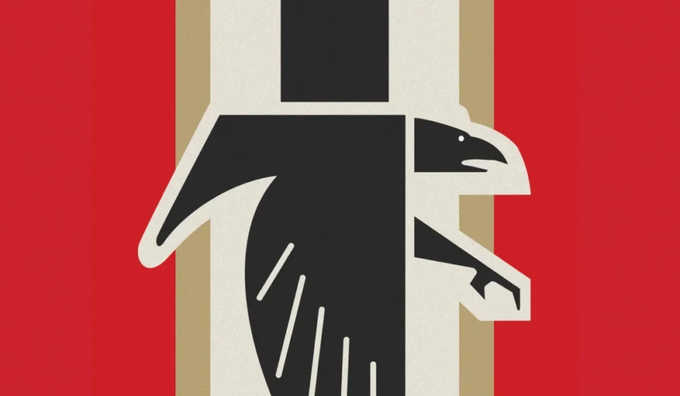
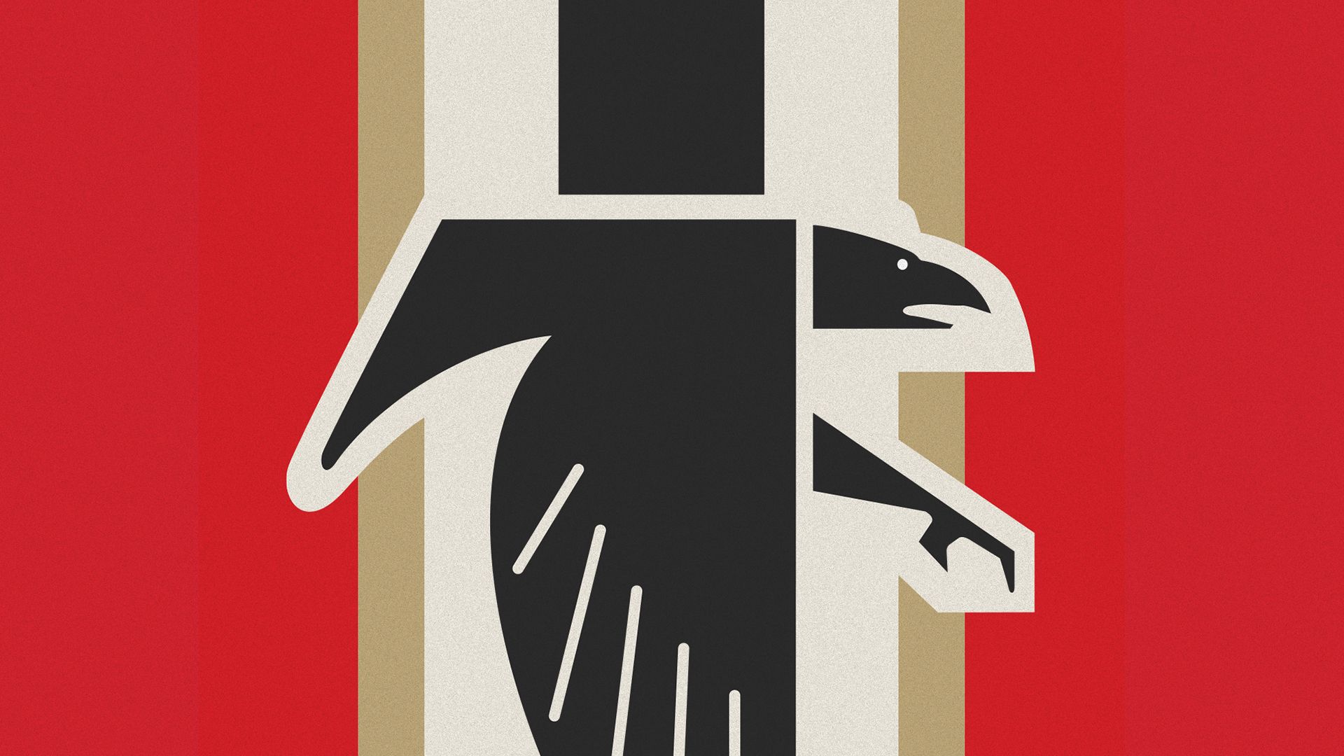
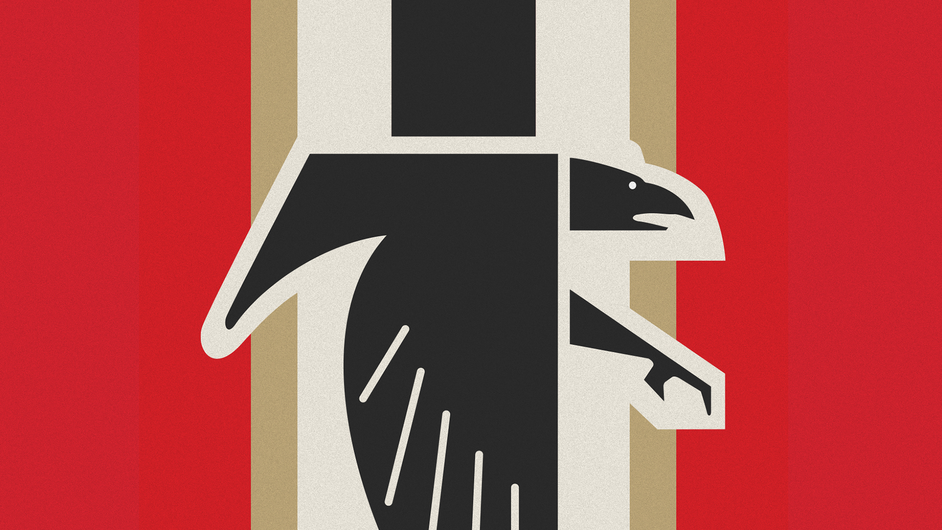
The organization’s recent decision to reintroduce a stylized, angular falcon logo, accompanied by a new color palette and vertical striping, has ignited a social media firestorm. Critics and casual observers alike have drawn uncomfortable parallels between the design and the iconography of the Third Reich, leading to widespread mockery and a heated debate about the necessity of historical awareness in modern graphic design.
The Chronology of a Branding Misstep
To understand the current backlash, one must look back to the origins of this specific visual identity. The design in question is rooted in the 1960s, a period when the Falcons first entered the NFL. In those early years, the team’s visual language was characterized by simpler, more aggressive geometric shapes.
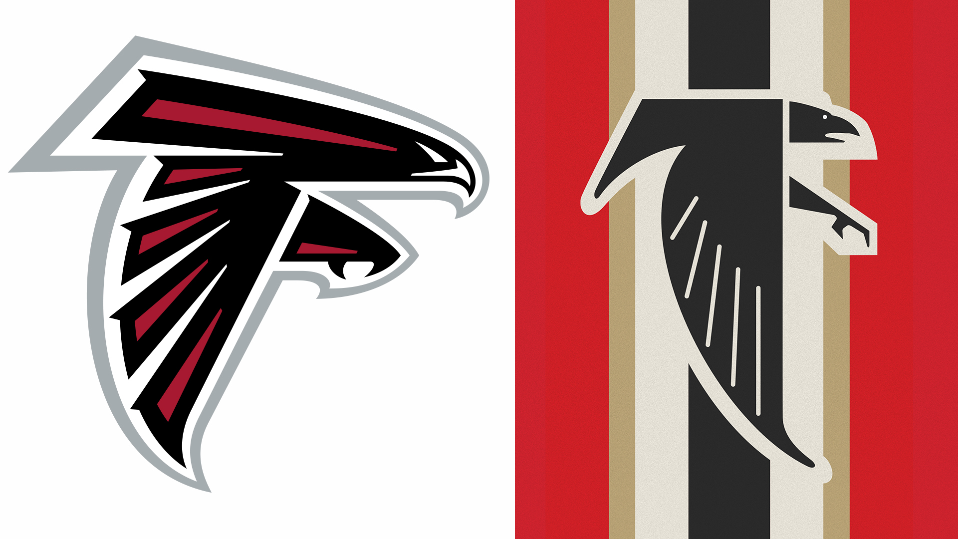
Two years ago, the team first flirted with controversy by reviving these 1960s-era motifs. At the time, the reception was mixed. While some purists appreciated the nod to the franchise’s founding years, others noted that the "hard" stylization of the bird of prey—combined with a stark black-and-red color scheme—evoked memories of mid-20th-century European propaganda art.
Rather than pivoting away from these criticisms, the organization doubled down. Ahead of a high-profile matchup against the San Francisco 49ers, the Falcons announced they would wear 1966-inspired uniforms, complete with red helmets, black jerseys, and white pants. To promote this event, they updated their social media profile pictures to a new, remixed version of the classic logo. This latest iteration, which places the angular falcon over a background of vertical black, red, and cream stripes, has proven to be the final straw for the internet, triggering a wave of viral backlash that the team could not have ignored.
The Anatomy of the Outcry: "Bird Reich" and the Power of Memes
The response on platforms like X (formerly Twitter) was both swift and merciless. Within hours of the logo’s unveiling, users began dissecting the design elements with forensic scrutiny. The most prominent nickname to emerge was the "Bird Reich," a moniker that succinctly captured the public’s discomfort with the aesthetic choices.
The vitriol was not limited to mere name-calling; it extended into the realm of political satire. One viral post read, "I read that the NFL wanted to conquer the world, but I didn’t think they meant it so literally." Another user, responding directly to the team’s official account, quipped, "Not a good look, meinami," a play on the team’s name that left little to the imagination regarding the user’s critique.
The internet’s ability to turn a corporate branding blunder into a global punchline is a testament to the hyper-vigilance of the modern digital age. Unlike the 1960s, when sports design was viewed primarily through a local lens, the modern digital landscape allows for rapid, cross-cultural comparison. Once a user identifies a visual link to a historical atrocity—regardless of the designer’s original intent—that connection becomes the dominant narrative.
The Designer’s Dilemma: Intent vs. Interpretation
In the world of professional design, there is a concept known as "the tyranny of the viewer." No matter how much research or historical grounding a designer puts into a project, the audience’s interpretation is the only one that dictates the brand’s success.
The Atlanta Falcons’ creative team likely argued that they were merely honoring the team’s heritage. Birds of prey have been used as national symbols for millennia, appearing in everything from Roman standards to the American bald eagle. The swastika itself, as many historians point out, has a deep, ancient history in Eastern cultures that predates its adoption by the Nazi party by thousands of years.
However, in the context of contemporary Western visual culture, specific combinations of geometric, angular birds and high-contrast, vertical striping carry a heavy, inescapable baggage. By choosing to lean into these specific motifs, the Falcons’ design team arguably committed a classic branding error: they prioritized historical accuracy to a specific, controversial era over the cultural sensitivity required for a modern, global audience.
Institutional Silence and the Risk of "Doubling Down"
One of the most notable aspects of this controversy is the lack of a formal, comprehensive apology or pivot from the Falcons organization. In the modern corporate playbook, when a campaign fails, the standard response is a swift retraction or a public statement explaining the "intended" message.
By remaining largely silent—or at least, by not changing the logo—the organization has allowed the conversation to be dominated by the critics. This approach carries significant risk. A sports franchise is, at its core, a brand that relies on community goodwill and sponsorship stability. When a brand is associated with symbols that invoke the darkest period of human history, it risks alienating fans and potentially scaring off corporate partners who are increasingly sensitive to "brand safety."
The question arises: Why continue to use the design? Perhaps the team believes that the "all publicity is good publicity" adage holds true, or perhaps they are so committed to the "retro" branding cycle that they are unwilling to admit a mistake. However, in the court of public opinion, silence is often interpreted as arrogance or indifference.
The Broader Landscape of Sports Branding
The Falcons are not the first team to face scrutiny for their branding, and they certainly won’t be the last. The history of the NFL is filled with logos that have aged poorly or caused discomfort. The Boston Red Sox, for example, have had their own historical branding controversies, and the debate over Native American mascots has led to massive, league-wide rebrands for teams like the Washington Commanders and the Cleveland Guardians.
What sets the Falcons situation apart is the sheer ease with which the issue could have been avoided. Unlike the complex, multi-year process of rebranding a team name, a logo update is a flexible asset. A subtle adjustment to the line work, a slight change in the color palette, or even a different background treatment could have preserved the "retro" feel without triggering the "fascist aesthetic" alarms.
The Legacy of the 1960s
The fact that this logo was used in the 1960s without widespread outcry is perhaps the most interesting piece of the puzzle. It invites a broader conversation about how our collective visual literacy has evolved. In the pre-internet era, design was consumed in isolation. A fan in Atlanta saw the logo on a program, a television broadcast, or a pennant. They did not have the ability to instantly compare it to a high-definition database of global historical archives.
Today, we live in a state of constant visual comparison. We are primed to see patterns, to recognize tropes, and to call out perceived similarities. The Falcons’ reliance on an "authentic" 1960s design ignores the fact that the viewer of 2026 is fundamentally different from the viewer of 1966.
Conclusion: Lessons for the Future
The "Bird Reich" controversy is a cautionary tale for any organization attempting to leverage the past. Nostalgia is a powerful tool, but it is not a shield against the realities of the present. When brands reach back into history, they must do so with a clear-eyed understanding of how their symbols will be decoded by a modern audience.
The Atlanta Falcons, for all their athletic success, have provided a masterclass in how not to navigate the intersection of sports heritage and cultural sensitivity. By ignoring the warning signs and doubling down on a design that was clearly destined to offend, the franchise has turned a celebration of its history into a distraction from its future.
As the NFL continues to expand its global footprint, the need for inclusive, thoughtful, and universally palatable branding will only grow. If the Falcons are to move past this, they must acknowledge that the "retro" appeal of a logo is subordinate to the values of the community they represent. Sometimes, the best way to respect the past is to acknowledge that some parts of it are better left in the archives.