
The Unblinking Gaze: Deconstructing the Nightmare Marketing of Nathan Fielder’s ‘You Can See Everything’

In the landscape of contemporary documentary filmmaking, few projects have managed to generate as much immediate, visceral unease as Nathan Fielder’s latest endeavor, You Can See Everything. While Fielder—best known for his signature brand of cringe-inducing social experiments in Nathan for You and The Rehearsal—has long played with the boundaries of discomfort, his foray into the life of disgraced Theranos founder Elizabeth Holmes has taken a dark, aesthetic turn. Following a teaser trailer that left audiences perplexed and unsettled, the project’s newly released promotional poster has solidified the documentary’s status as a masterclass in psychological horror marketing.
The Visual Anatomy of Discomfort
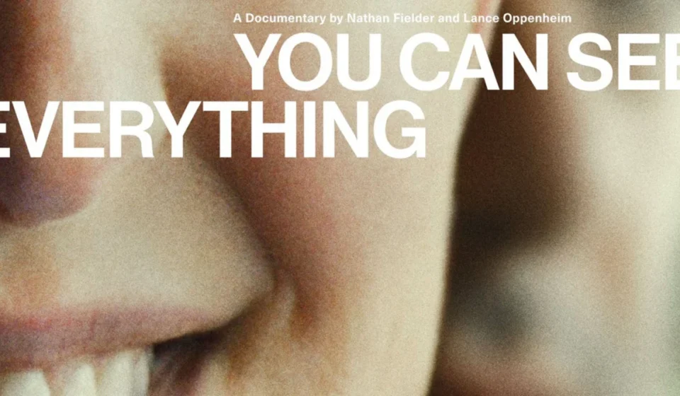
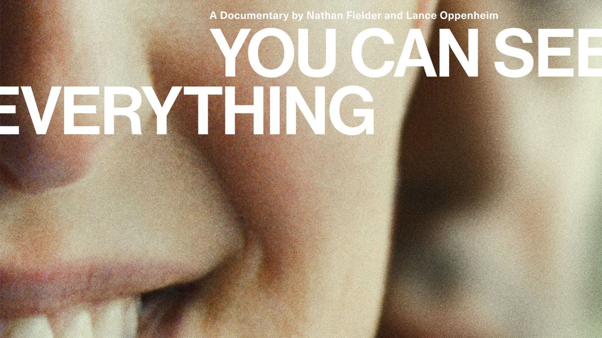
The new poster for You Can See Everything is a study in minimalist terror. Drawing inspiration from the most effective tropes in horror film design, the artwork utilizes suffocating close-ups and high-contrast lighting to create a sense of inevitable dread.
The image centers on a hyper-focused, claustrophobic shot of Elizabeth Holmes. By spotlighting only half of her face, the designers have stripped away the context of her surroundings, forcing the viewer to confront her eyes—specifically, an unnervingly bright blue iris that appears strained in its unnatural width. This is not merely a portrait; it is an interrogation of the gaze. The half-concealed smile playing across her lips adds a layer of "uncanny valley" dissonance, transforming a familiar public figure into an entity that feels inherently wrong.
In the background, the blurred, almost spectral presence of Nathan Fielder provides a secondary layer of tension. He is present yet indistinct, acting as a voyeuristic anchor to the composition. The title, rendered in a stark, minimalist sans-serif font, is strategically cropped at the margins. This deliberate truncation reinforces the sense of claustrophobia, suggesting that the subject—and perhaps the truth itself—cannot be contained within the frame.
Chronology of a Viral Disturbance
The journey toward this visual confrontation began weeks ago, when the first teaser for the documentary hit the internet. Fielder, who is known for his secretive production methods, offered little in the way of traditional narrative exposition. Instead, the teaser focused on rhythmic, repetitive imagery that emphasized the bizarre mannerisms of Elizabeth Holmes, particularly her infamous, unblinking stare.
Phase 1: The Teaser Release
Upon its debut, the teaser immediately dominated social media discourse. Unlike traditional documentaries that aim to humanize or explain their subjects, Fielder’s footage seemed to treat Holmes as an architectural curiosity—a specimen to be observed under a microscope. The reaction was swift: viewers reported a feeling of "parasocial exhaustion," noting that the footage felt less like a biographical film and more like an endurance test.
Phase 2: The Poster Reveal
As anticipation for the documentary grew, the marketing team doubled down on this mood. The release of the official poster marked a pivot from "bizarre" to "horror." By adopting the visual language of psychological thrillers—such as The Silence of the Lambs or Possessor—the creative team successfully rebranded the documentary. It was no longer just a project about a corporate fraudster; it was being framed as an descent into the psyche of a modern-day villain.
The Role of Design in Modern Marketing
Why does this poster work so effectively? From a design perspective, the poster leverages what psychologists call "attentional capture." The eye is naturally drawn to the most human element of an image—the face—and when that face is distorted or framed in a way that defies social norms, the brain enters a state of heightened arousal.
"The reflection in the eye is doing more acting than most lead performances this year," one user noted on X (formerly Twitter). This sentiment highlights a shift in how audiences are engaging with promotional materials. We are no longer satisfied with static headshots; we are looking for narrative clues in the micro-expressions of the subjects.
The design team’s decision to avoid excessive color palettes or complex textures serves the overarching theme of the documentary. In an era of visual overload, the "less is more" approach acts as a vacuum, sucking the viewer’s attention into the abyss of the subject’s expression. It is a bold, frighteningly captivating choice that makes the act of looking away feel like a deliberate effort.
Implications for Documentary Filmmaking
The reception of You Can See Everything—and its marketing campaign—raises significant questions about the future of the documentary genre. Traditionally, documentaries have been expected to provide clarity and context. However, Fielder’s work suggests a shift toward a more subjective, impressionistic style of non-fiction storytelling.
The Blurring of Genres
By utilizing the aesthetics of horror, Fielder is effectively challenging the audience’s expectations of the documentary form. If a documentary can evoke the same visceral, fight-or-flight response as a slasher film, does it alter our perception of the truth being presented?
The Ethical Lens
There is also an ethical dimension to this marketing. By turning Elizabeth Holmes into a "horror movie monster," the production is arguably participating in the same cycle of myth-making that the documentary likely intends to critique. Does this design choice trivialize the real-world harm caused by the Theranos scandal, or does it accurately capture the "monster" image that the public has constructed around Holmes?
Public Reaction and Cultural Commentary
The internet has responded with a mixture of fascination and genuine alarm. The consensus among design critics and casual viewers alike is that the poster is a triumph of branding. It has successfully turned the project into a "must-see" event, not because people want to learn about medical fraud, but because they are compelled by the spectacle of the disturbing.
One X user summarized the general feeling perfectly: "You could tell me this was a horror movie and I’d believe you." This comment speaks to the power of the visual medium to override previous knowledge. Even though we know who Elizabeth Holmes is, the poster manages to strip away our intellectual context and replace it with a gut-level, visceral reaction.
Comparing the Aesthetic to Contemporary Trends
In the broader context of graphic design, You Can See Everything follows a growing trend of "creepier" marketing materials. We have seen similar approaches with recent horror-adjacent posters, such as the widely discussed Clayface imagery, which similarly utilized intense, uncomfortably detailed facial close-ups to generate buzz.
However, where those posters exist within the safe confines of fiction, Fielder’s work occupies a liminal space. Because it is a documentary about a real person, the discomfort is compounded by the knowledge that the subject is a flesh-and-blood individual. This creates a friction that is difficult to sustain, making the poster not just a piece of advertising, but a significant cultural artifact that defines our current era of "true crime as psychological horror."
Conclusion: A Mirror Held Up to the Audience
Ultimately, the marketing for You Can See Everything serves as a mirror. The documentary, and the poster that heralds it, are not just about Elizabeth Holmes; they are about us—our collective obsession with the rise and fall of icons, our hunger for the uncomfortable, and our inability to look away from the train wreck.
As the release date approaches, the industry will be watching closely to see if the documentary itself can live up to the promise of its promotional material. If the film is even half as effective as its poster, it will likely redefine the documentary genre for years to come. In the meantime, the image of that unblinking, wide-eyed gaze will continue to haunt the feeds of those who have seen it, serving as a reminder that in the right hands, design is not just a tool for promotion—it is a weapon of psychological influence.
Whether one finds it genius or exploitative, one thing is certain: Nathan Fielder has once again ensured that we are all, quite against our better judgment, watching.