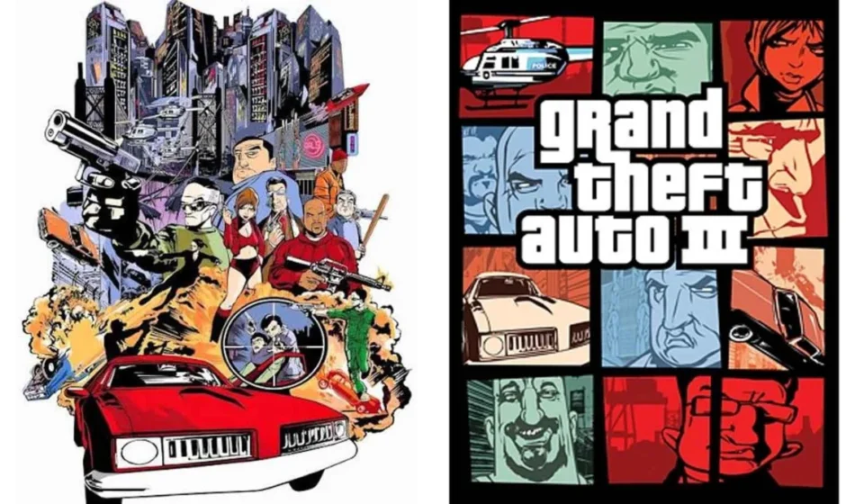

The box art for Grand Theft Auto 6 is more than just a promotional image; it is a cultural artifact. Even before a viewer registers the specific character silhouettes or the vibrant, sun-drenched palette of Vice City, the visual language is unmistakable. It is a collage—a frenetic, multi-paneled mosaic of criminal escapades, high-speed chases, and urban grit. This aesthetic, which has become synonymous with the Grand Theft Auto (GTA) franchise for over two decades, is now so deeply ingrained in gaming culture that it feels inevitable.
However, as revealed by Rockstar co-founder Dan Houser, the aesthetic that defines the series was not a calculated long-term branding strategy. It was a desperate, eleventh-hour pivot born from the shadow of the September 11 terrorist attacks.
A Legacy Born from Crisis
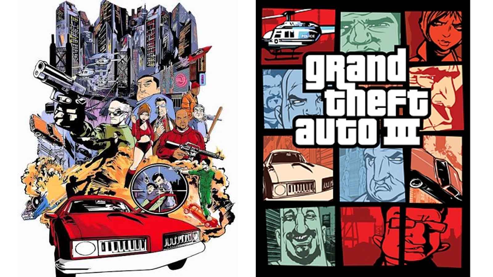
In the high-stakes world of triple-A video game development, the box art is the final handshake between a developer and its audience. It is the visual shorthand that must convey the tone, scope, and soul of a game in a single glance. For Grand Theft Auto 3—the game that arguably pioneered the 3D open-world sandbox—the original plan for the cover was vastly different.
The initial concept was evocative of a gritty, 1970s action-movie poster. It featured a cinematic, singular scene of a blown-up bridge, police officers firing into the air, and helicopters circling overhead. It was dramatic, literal, and intended to capture the chaos of the game’s Liberty City. However, as the industry and the world reeled from the geopolitical shifts following September 11, 2001, the team at Rockstar realized that the imagery of urban destruction and police-involved violence felt not only insensitive but dangerously out of step with the public mood.
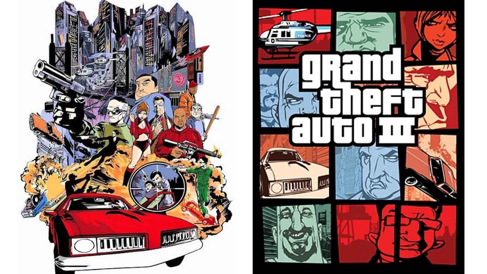
With the game scheduled for release in October 2001, Rockstar found itself in a precarious position. The original cover art, which had reportedly taken six months to illustrate, had to be scrapped entirely. The result was a sudden, high-pressure scramble to redesign the identity of a franchise that was about to change the industry forever.
The Chronology of the Pivot
The timeline of this transition remains a subject of slight, yet fascinating, debate among those who were in the room. Dan Houser has famously stated in interviews that the iconic grid-style cover art—the template that would eventually adorn Vice City, San Andreas, GTA IV, GTA V, and now GTA 6—was a "rush job" completed by artist Stephen Bliss in just two evenings.
Conversely, Stephen Bliss has provided a slightly more measured account of the timeline, suggesting he was given roughly a week to execute the redesign. Regardless of the exact hour count, the intensity of the deadline remains undisputed. In a matter of days, Bliss had to conceptualize a layout that could effectively communicate the game’s depth without relying on the singular, high-octane narrative scene that had been deemed inappropriate for the post-9/11 landscape.
This pivot forced the team to rethink their approach to marketing. Instead of trying to tell one story on the cover, they opted to show many. By segmenting the art into a series of frames—each depicting different vehicles, characters, and urban vistas—they created a "visual menu" of the game’s mechanics. This was not just a clever design choice; it was an accidental masterclass in branding. It allowed the game to feel expansive and multifaceted, hinting at the freedom of the open world rather than the singular intensity of a movie scene.
The Anatomy of an Icon
The "GTA Style" has become a cornerstone of visual design in entertainment. By utilizing a grid of varying panel sizes, Rockstar achieved a sense of controlled chaos. This template is inherently flexible: it can accommodate any setting, any era, and any cast of characters, while maintaining a consistent "family" identity.
Why the Template Endures:
- Modular Flexibility: The grid system allows Rockstar to swap in new assets for every installment. Whether it is the neon-soaked streets of a modern-day Florida parody or the grime of the early 2000s, the template holds it together.
- The "Comic Book" Effect: The collage approach mimics the aesthetic of pulp fiction novels and comic books, which perfectly aligns with the satirical, hyper-stylized nature of the GTA writing.
- Visual Density: By stuffing the box with windows containing cars, weapons, and NPCs, the art promises the player a sense of "value." It signals that the world within is packed with content.
Official Responses and Industry Context
The story of the GTA 3 cover art serves as a pivotal case study in crisis management within the creative arts. When Houser recounted the experience to IGN, it underscored a vital truth: the most enduring elements of a brand are often the ones created under the most restrictive conditions.
It is worth noting that the "original" binned artwork was not destroyed, nor was it entirely abandoned. It persisted in the European market for a time, serving as a rare artifact for collectors and a reminder of the game’s original, more explosive vision. For many British players and international fans, the "alternative" cover art is a piece of history that sits in garages and attics—a physical manifestation of a timeline that North American players never saw.
This duality created a unique phenomenon where two generations of players have different "canonical" memories of the same game. It highlights how the geography of a product release can fundamentally alter its cultural footprint.
Implications for the Future: GTA 6
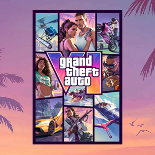
As Rockstar prepares for the release of Grand Theft Auto 6, the reliance on this established visual template is more significant than ever. By sticking to the grid, Rockstar isn’t just following a design trend; they are engaging in a form of visual shorthand that triggers immediate recognition.
When fans see the new cover art, they are not just looking at a game package; they are participating in a 25-year tradition. The fact that the design was born out of a desire to pivot away from the trauma of 2001 makes its longevity even more poignant. It shows that even in the face of tragedy, the creative process can find a way to adapt, evolve, and ultimately create something that becomes timeless.
The "GTA style" is, in many ways, the antithesis of the minimalist design trends that dominate much of modern tech and media. While other brands are stripping away detail, Rockstar is leaning into the noise. The collage remains a perfect metaphor for the games themselves: vast, cluttered, overwhelming, and utterly impossible to look away from.
Conclusion
The evolution of the Grand Theft Auto cover art is a testament to the power of artistic resilience. What began as a panicked, two-day reaction to a global tragedy transformed into one of the most recognizable graphic design templates in the history of interactive entertainment.
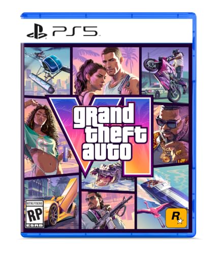
As we look toward the November 19th launch of GTA 6, it is clear that the grid will remain. It is a visual promise that the chaos of the city—the cars, the characters, and the criminal life—is contained within, waiting for the player to dive in. Stephen Bliss and the team at Rockstar may have scrambled to finish that first cover in 2001, but they inadvertently built a visual language that has defined a generation of gaming, proving that sometimes, the best creative decisions are the ones we are forced to make in the dark.