
The Identity Crisis: Is Coca-Cola’s Design Refresh a Masterclass in Branding or a Consumer UX Failure?

When Coca-Cola announced its global design overhaul earlier this year, the objective was framed with the corporate precision typical of a multi-billion-dollar beverage giant. The company sought to unify its visual identity under one "bold, simplified" system. The goal was to make the world’s most recognizable soft drink look, as they put it, "more Coca-Cola."
However, three months into the rollout, the reality on the ground—and on the shelves—tells a more complicated story. What was intended to be a masterclass in brand consistency has devolved into a heated debate over user experience (UX), consumer safety, and the potential hidden agendas of corporate design strategy. As the new packaging populates refrigerators and vending machines globally, a chorus of confusion is rising from those who find the new, nearly identical aesthetics of standard Coke and Coca-Cola Zero Sugar to be a significant functional downgrade.
The Evolution of a Brand: A Chronological Look
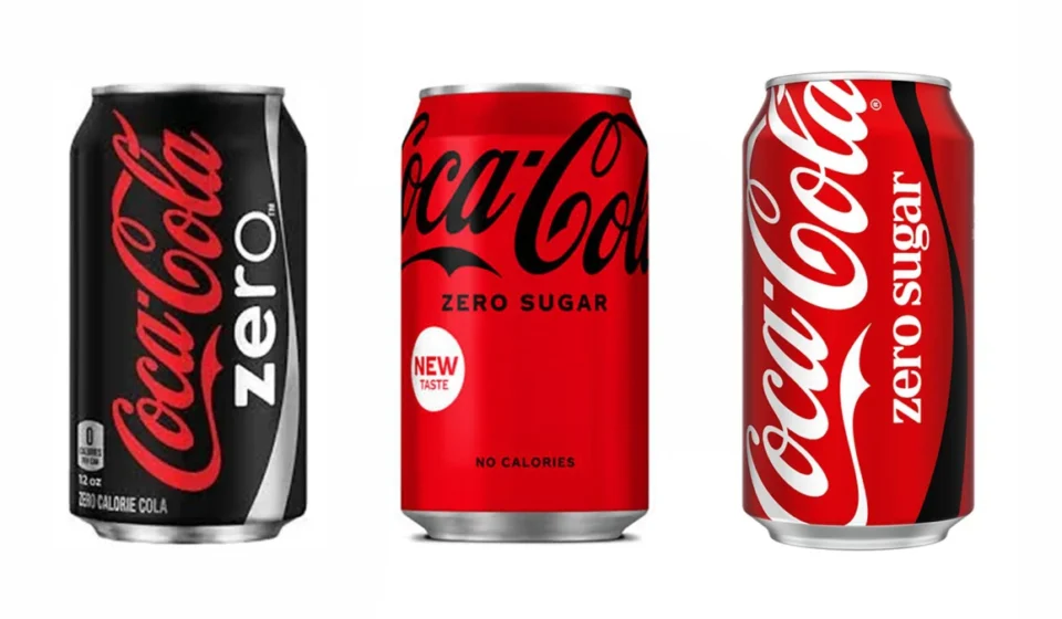
To understand the current controversy, one must look at the historical trajectory of the Coca-Cola Zero brand. Launched in 2005 as a strategic answer to the growing health-conscious consumer market, "Coke Zero" was purposefully designed to look distinct. Its iconic black can served as an immediate visual shorthand, allowing consumers to distinguish the product from the classic red-can standard Coke in a split second.
The evolution of this visual language has been marked by several key pivots:
- 2005: The birth of the black can. It was bold, sleek, and physically impossible to confuse with the red, white, and script-heavy classic Coke.
- 2016: A major rebrand saw the product shift toward the "One Brand" strategy, though it retained a strong black-dominant color scheme to ensure shelf-level differentiation.
- 2024: The latest redesign further reduced the black footprint to a mere accent, favoring a dominant red palette across both the standard and the "Zero Sugar" variants.
The shift, according to Coca-Cola’s official messaging, was about "delivering one recognizable brand experience." But by prioritizing aesthetic harmony over functional contrast, the brand has effectively erased the very visual cues that millions of shoppers relied on to make rapid purchasing decisions.
The "User Experience" Breakdown
Design is, at its core, a tool for communication. When the aesthetic of a product hinders the user’s ability to interact with it safely or efficiently, it is widely considered a failure of industrial design. This is precisely what critics are arguing.
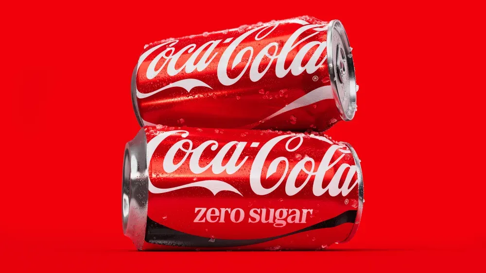
The issue has gained traction on social media, with the most vocal complaints coming from those who interact with the product at a high frequency. An Australian flight attendant’s recent viral TikTok video—in which she confessed to "losing count" of the number of times she had mistakenly served the wrong drink to passengers—has become a flashpoint for the debate. In a high-pressure environment like a cabin, where service must be fast and precise, the subtle differences between the new cans are insufficient.
The confusion, however, extends far beyond the professional sphere. In thousands of comments across social media platforms like Reddit and TikTok, consumers are highlighting a more dangerous byproduct: the risk to those with specific dietary needs.
Supporting Data: When Branding Impacts Health
For the average consumer, grabbing a "Zero" instead of a "Regular" might result in a disappointing flavor experience. For a diabetic or someone with a severe allergy to aspartame or other artificial sweeteners, the consequences of this design shift are not merely inconvenient—they are potentially medical.
"I rely on that black lettering for Zero because I am diabetic," one user commented in a thread discussing the redesign. "Why on earth would they do that?" Another noted, "I’m allergic to an ingredient in Coke Zero but can have regular Coke. Why would they think this is a good idea?"
These concerns point to a significant oversight in the testing phase of the rebranding process. While focus groups often evaluate "brand preference" and "visual appeal," they frequently fail to account for "real-world friction"—the cognitive load placed on a shopper in a dimly lit aisle, a busy restaurant, or a crowded festival stand. When the visual distinction between two chemically different products is minimized to the point of invisibility, the brand assumes a level of consumer attention that simply does not exist in the real world.
The "Marlboro" Comparison and the Politics of Design
The criticism of the new design goes deeper than utility; it touches on the perception of the brand itself. Since the reveal, critics have drawn unfavorable parallels between the new, minimalist Coca-Cola script and the aesthetic language of the tobacco industry—specifically Marlboro.
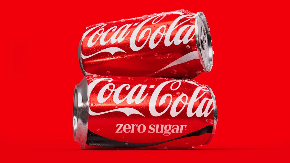
Design analysts suggest that the move toward a "cleaner," more monochromatic look is a trend across the consumer goods sector, often intended to make products feel "premium" or "timeless." However, by stripping away the color-coded nuances of the Zero line, the brand has inadvertently moved toward a utilitarian uniformity that some argue feels clinical or, in the case of the cigarette comparisons, somewhat sterile.
Is There a Hidden Agenda?
In the vacuum of official explanation, speculation has flourished. A prevailing theory on forums like Reddit suggests that the visual unification is not a mistake, but a calculated, long-term strategy.
By blurring the lines between standard Coke and Coke Zero Sugar, the company may be attempting to "nudge" consumers toward the sugar-free option. With increasing regulatory pressure in the form of sugar taxes and stricter health-labeling laws across the EU, the UK, and parts of the Americas, Coca-Cola is under immense pressure to shift its volume away from high-sugar products.
If the two cans look the same, the consumer might be less likely to reject the Zero option if their preferred regular Coke is out of stock. It is a form of "choice architecture" that subtly steers the buyer toward the healthier (and more regulator-friendly) alternative.
Coca-Cola, however, has denied any intention to phase out its original recipe. The company continues to invest in regional variations of its classic drink, such as the sugar-cane-based formulations found in Mexico and various parts of Europe. Despite these assurances, the skepticism remains, fueled by the fact that the design change disproportionately favors the branding of the "Zero" line.
Official Responses and the Corporate Stance
Coca-Cola’s official press releases surrounding the rebrand emphasize "boldness" and "simplicity." They argue that the brand’s power lies in its ubiquity and that a simplified, unified look strengthens the brand’s global equity.
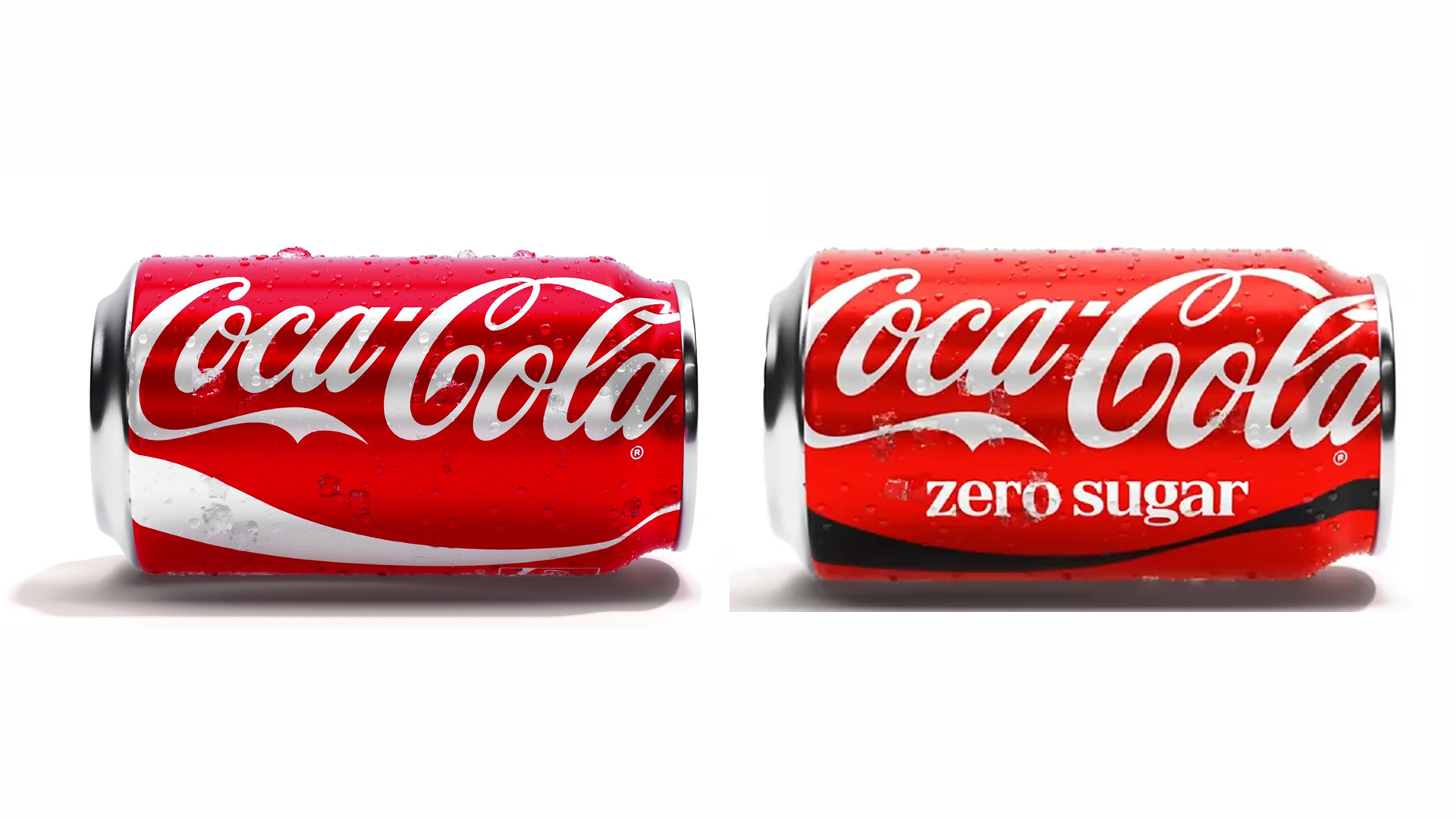
In response to the growing backlash, the company has largely remained committed to the new aesthetic, suggesting that the "new look" is a transition that consumers will eventually normalize. However, the disconnect between corporate vision and user feedback suggests a failure to consider the "accessibility" component of design.
For a company that has spent over a century building a brand based on immediate, visceral recognition, the current confusion is an uncharacteristic stumble. Whether this will lead to a "Version 2.0" of the packaging or if the market will eventually adapt remains to be seen.
Conclusion: The Lesson for Future Branding
The Coca-Cola redesign serves as a cautionary tale for global brands. It illustrates that in the race to modernize and streamline, companies often forget that the primary job of packaging is to communicate information, not just to look good.
When a design refresh complicates the user experience, it risks alienating the very people it aims to serve. As consumers, we rely on color, shape, and contrast as cognitive shortcuts. By removing those shortcuts, Coca-Cola has inadvertently created a friction-filled experience that is causing genuine frustration.
If the company wishes to maintain its position as a global leader in beverage design, it may need to reconsider whether the "aesthetic harmony" of a uniform shelf is worth the cost of consumer confusion and the loss of trust. Until then, shoppers are left to do what they have always done: squint a little harder at the label, hoping they’ve grabbed the right can before they crack it open.