

In the volatile world of corporate identity, the "rebrand" has become a high-stakes gamble. From the polarizing shift at Jaguar to the ongoing discourse surrounding legacy brands like Cracker Barrel, the modern design landscape is littered with the wreckage of companies attempting to shed their history in favor of contemporary aesthetics. Often, these updates are dismissed as corporate "wokeness" by internet pundits, a reductive lens that frequently misses the mark. However, in the case of the venerable British brewery Timothy Taylor’s, the recent outcry suggests a more nuanced failure: a disconnect between modern marketing sensibilities and the authentic character that built a brand’s longevity.
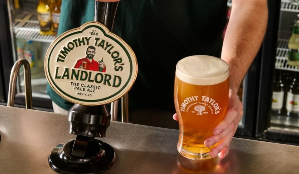
Timothy Taylor’s, a cornerstone of Yorkshire’s brewing heritage, has recently unveiled its first major visual overhaul in over a decade. The refresh spans a new logo, updated packaging, reimagined pump clips, and, most controversially, a redesigned central character for its flagship Landlord ale. While the company claims the update is an attempt to stay relevant to a burgeoning generation of cask ale enthusiasts, critics argue that in their pursuit of "modernity," the brewery has inadvertently scrubbed away the very personality that made them a staple of the British pub experience.
A Chronology of Change: From Tradition to the "Modern" Look
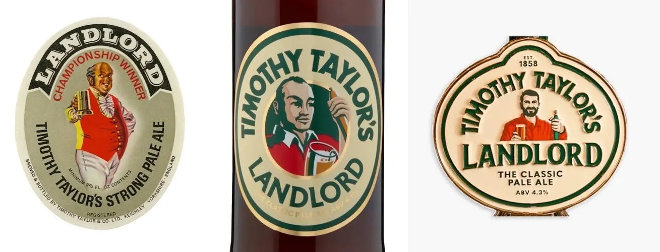
The Timothy Taylor’s brand has long been synonymous with consistency. For decades, its visual identity was rooted in a rustic, honest aesthetic that reflected the rugged terrain and traditional values of its Keighley home. The previous branding relied on a recognizable, weathered character—the quintessential "landlord"—who served as a visual anchor for the product.
In recent months, the brewery initiated a comprehensive redesign, partnering with branding agencies to bring its look into the 2020s. The process was not merely a tweak of the color palette; it was a fundamental shift in the brand’s visual lexicon.
- The Announcement: The brewery confirmed that the update would touch every touchpoint, from the tap handles in pubs to the labels on bottled beer.
- The Reveal: The new identity was rolled out with a cleaner, more minimalist typeface and a refreshed color scheme intended to pop on modern retail shelves and digital social media feeds.
- The Controversial Pivot: The most significant change was the overhaul of the "Landlord" character. The figure, previously depicted with the characterful, aged features of a classic pub keeper, has been replaced by a younger, arguably more "polished" version—fuller hair, a sharper chin, and a look that feels more akin to a boutique microbrewery’s mascot than a legacy ale icon.
Supporting Data: The Gen Z Paradox in Cask Ale
The motivation behind this overhaul, according to CEO Andrew Carter, is rooted in the demographic shift within the beer industry. The brewery is keen to capture the attention of Gen Z drinkers, who have shown an unexpected and growing interest in traditional cask ale.
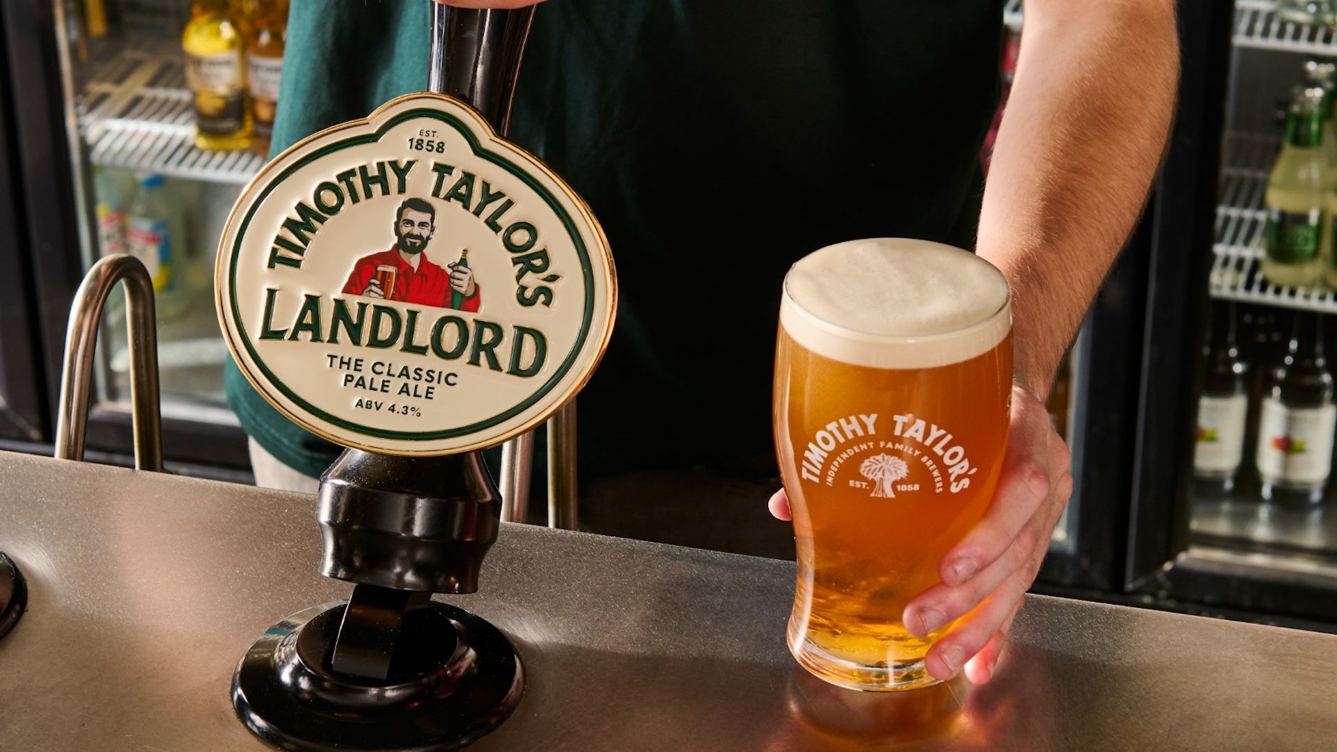
"This refresh is not about changing what we make," Carter stated in recent interviews. "It is about ensuring the quality and care that go into every pint are reflected in how Timothy Taylor’s is presented today." The stated goal is to remain as relevant to the next generation of drinkers as the brand has been to the last.
However, market data presents a paradox for such brands. While the brewery aims to attract younger demographics, current trends in design suggest that "heritage" is actually the most potent currency for Gen Z. Unlike previous generations that chased the "new and improved," younger consumers are increasingly drawn to authentic, storied, and slightly "imperfect" brands.
When major brands like Burger King or Pepsi have successfully rebranded, they often did so by looking backward—resurrecting vintage logos and embracing retro aesthetics that signify provenance and quality. Timothy Taylor’s appears to be moving in the opposite direction, favoring a sanitized, digital-first look that risks losing the very "cultural currency of history" that makes heritage brands desirable to younger drinkers in the first place.
Official Responses and the Industry Reaction
The response from the public and design critics has been swift and, at times, scathing. While some see the update as a necessary step toward visual cohesion in a competitive market, others view it as an act of "corporate gentrification."
Design experts point out that the previous branding possessed a certain "genuine character"—the kind of visual weight that design agencies often charge small fortunes to manufacture for new startups. By replacing a relatable, lived-in face with a model-like character, the brewery has inadvertently transitioned from "traditional" to "generic."

In the wider design community, the consensus is that the brand has mistaken "unfashionable" for "low quality." There is a distinct fear that by chasing a flat, minimalist, sans-serif aesthetic, Timothy Taylor’s is falling into the trap of "blanding"—the process by which companies adopt similar visual markers to the point where they become indistinguishable from their competitors.
While some high-profile publications have called the rebrand a "disgrace," others suggest that the discourse is being over-politicized. It is, after all, a beer label. But the intensity of the reaction highlights a deeper truth: consumers form emotional attachments to brand identities. When those identities are stripped of their historical idiosyncrasies, customers feel as though they have lost a piece of a shared cultural experience.
Implications: The Lesson for Heritage Brands
What, then, is the takeaway for the industry at large? The Timothy Taylor’s case serves as a stark reminder that modernization does not necessitate a complete aesthetic overhaul.
1. The Trap of "Modernizing"
Modernizing a heritage brand often leads to a "uncanny valley" effect. When a company with deep roots tries to look like a Silicon Valley tech firm, it creates cognitive dissonance for the consumer. The lesson here is that longevity is an asset, not a liability. If a brand is already popular, it is likely because its visual identity conveys a specific promise of quality that is tied to its history.
2. The Value of Imperfection
In an era dominated by artificial intelligence, photorealistic digital renders, and hyper-polished flat design, there is a renewed premium on "human" design. Peculiarities—the slightly uneven typography, the weathered faces of characters, the "unfashionable" color palettes—are what prevent a brand from slipping into the sea of corporate homogeneity.
3. Knowing Your Audience
The brewery’s pivot toward Gen Z is logical in theory, but perhaps misinformed in execution. If the goal is to reach younger, more discerning drinkers, the answer is rarely to make the brand look "younger." It is, ironically, to lean into the brand’s history, authenticity, and craft. Younger consumers are not looking for a "Gen Z version" of a traditional ale; they are looking for the real deal.
A Future in Fermentation
It is unlikely that the rebrand will result in a drop in sales or a mass exodus of the brewery’s core customer base. Timothy Taylor’s Landlord is, by all metrics, the UK’s best-selling cask ale by value and volume, and the liquid inside the bottle remains unchanged. The beer will, undoubtedly, still taste like the quality pint it has always been.
However, the brand has provided a cautionary tale for any legacy business currently sitting in a boardroom considering a "refresh." When you have a history that spans generations, you are not just selling a beverage; you are selling a piece of cultural fabric.
As the dust settles, the brewery faces the challenge of proving that its new look can hold the same authority as the old one. If they are lucky, the strength of their product will overcome the perceived weakness of their new identity. If they are not, the backlash will serve as a permanent case study in why sometimes, the best way to move forward is to remember exactly where you came from.
In the final analysis, the "Landlord" has been given a makeover that feels more like an eviction. By trying to fit a classic into a modern suit, the brewery has reminded us that in the world of branding, polish can sometimes be the enemy of character. Whether this is a momentary stumble or a strategic shift in direction remains to be seen, but for now, it stands as a reminder that heritage is a fragile thing—once it’s polished away, it is nearly impossible to get back.